The colors of

Showcasing specific payware addon products. This forum is where the aim of the shot is payware products. Please upload images to Simviation before posting

The colors of

Postby ramsa329 » Fri Nov 17, 2006 6:30 pm

FSX.

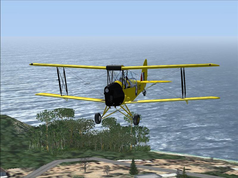
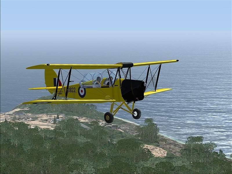
This week we are looking at 2 new FSX planes.

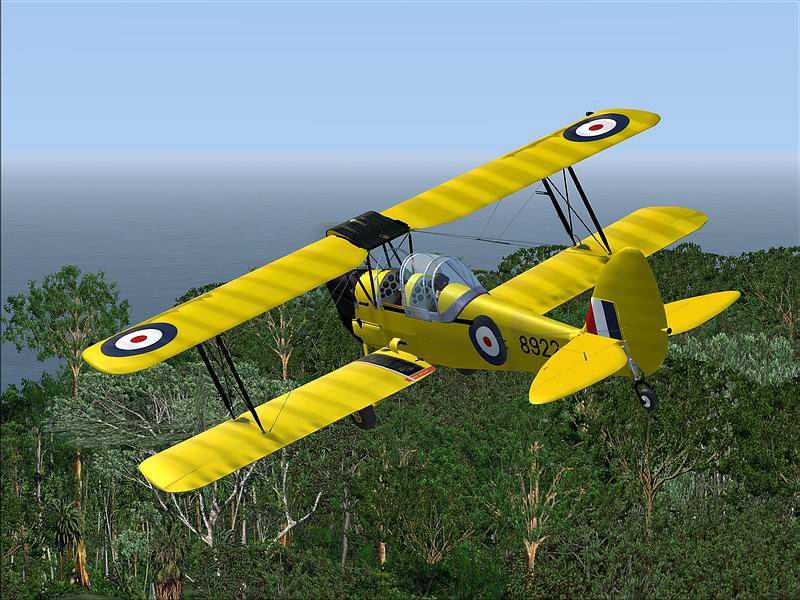
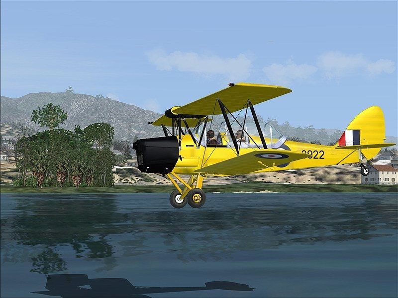
The first is the very very nice Just Flight Tiger Moth flying up the California coast around Santa Barbara from my hometown of Long Beach.

FSX is IMHO very accurate for Southern Cal.

Have a look!!!

Image

Image

Image

Image

Image
www.fs-gs.com
ramsa329
Major
Major
 
Posts: 1928
Joined: Mon Mar 18, 2002 1:11 am

Re: The colors of

Postby Harold » Fri Nov 17, 2006 6:37 pm

Very very cool Mike! Me likes! Great shots, especially #1 :o
There's such detail in that shot! You can almost see the vains in the leafs ;)

However I find them a little 'grainy' if that is the right word to use.

But still ... keep 'em coming!
User avatar
Harold
Lieutenant Colonel
Lieutenant Colonel
 
Posts: 5906
Joined: Wed Apr 12, 2006 5:13 am
Location: NL

Re: The colors of

Postby ramsa329 » Fri Nov 17, 2006 6:45 pm

Yes of course they are I hadn't really seen that or I wouldn't have posted them
Last edited by ramsa329 on Fri Nov 17, 2006 6:46 pm, edited 1 time in total.
www.fs-gs.com
ramsa329
Major
Major
 
Posts: 1928
Joined: Mon Mar 18, 2002 1:11 am

Re: The colors of

Postby Harold » Fri Nov 17, 2006 6:49 pm

I'm sorry but I'm not sure what you exactly mean ... especially the 'ofcourse' part.
Last edited by Harold on Fri Nov 17, 2006 6:50 pm, edited 1 time in total.
User avatar
Harold
Lieutenant Colonel
Lieutenant Colonel
 
Posts: 5906
Joined: Wed Apr 12, 2006 5:13 am
Location: NL

Re: The colors of

Postby ramsa329 » Fri Nov 17, 2006 8:15 pm

Harold,

Please read the whole post.

I don't know what to say or how to reply when you say what you said.

I absolutely do not think these shots are grainy or that compression killed my other shots as has been said in the past.

I do not constantly feel like or want to get into some " I'm more observant than you are" post.

I have no idea what your screen settings are, which monitor and its settings you are using, your video card or anything else.

These shots were taken at a particular time of day with ASV6 weather. They are naturally muted and there are a lot of reflections going on.

Quite possibly some of what you are seeing is the way FSX handles this type of condition and viewing it is new for you.

Quite possibly the graininess that you perceive is part of the way the Just Flight plane's paint picks up and returns reflections.

And of course here are built in problems that exist for any sim or video card when dealing with intensly bright colors such as this yellow.

So maybe it's all these things or some of them.

So in order to avoid all the usual "mine is bigger than yours" posts I answered you in the way I did.

But in the end I didn't avoid anything did I. LOL
www.fs-gs.com
ramsa329
Major
Major
 
Posts: 1928
Joined: Mon Mar 18, 2002 1:11 am

Re: The colors of

Postby Clipper » Fri Nov 17, 2006 9:54 pm

I agree with Harold, some great looking shots here.  :)Ramsa, I'm really concerned about getting FSX as I've been reading a lot of people are having issues with frame rates. What's your advice, I've got a decent system, but am only averaging about 22-25 in FS9 with everything pretty well maxed out.  ???
Image
User avatar
Clipper
Global Moderator
Global Moderator
 
Posts: 8420
Joined: Tue Aug 23, 2005 5:40 am

Re: The colors of

Postby ramsa329 » Sat Nov 18, 2006 1:00 am

Clipper,

Thanks,

I would need to know everything about your machine before I could tell you anything.
www.fs-gs.com
ramsa329
Major
Major
 
Posts: 1928
Joined: Mon Mar 18, 2002 1:11 am

Re: The colors of

Postby Harold » Sat Nov 18, 2006 4:47 am

Hi Michael,

Just as you I'm not interested in a 'your's is bigger than mine' discussion (I really like that expression ;D) I would just like to find out what you're doing (without, obviously giving away your tricks of the trade), so I can make my shots better; I think they cannot touch yours ;) I've always thought and still do that your shots are really really great!

I hope you don't mind me saying this but when I look at them it looks like they went trough some image sharpening tool (i.e. Photoshop), because I find the edges of the objects in your shots to be a little grainy. I don't know whether this is called compression or not and I'm definately not the most observant guy in the world ;D

Or maybe it's the settings on your card? I've been told you're on a 7950 to you must have played with image sharpening and contrast and the likes. I'm on a 7800 GS+ and found that using too much image sharpening creates 'grainy' shots. So I use very little of that. I just raised the contrast a little and I'm pretty happy with the results.

As for the monitor I'm on a Dell 1901FP which I run at 1280x1024 @ 75 Hz.

I hope we can have an interesting discussion :)


Image
Last edited by Harold on Sat Nov 18, 2006 4:49 am, edited 1 time in total.
User avatar
Harold
Lieutenant Colonel
Lieutenant Colonel
 
Posts: 5906
Joined: Wed Apr 12, 2006 5:13 am
Location: NL

Re: The colors of

Postby ramsa329 » Sat Nov 18, 2006 2:12 pm

Harold,

In these shots I didn't use any image sharpening since there was no need after reduction.

As I guessed it's you that's using it. LOL

But let's say for the purpose of this discussion I accept that there is graininess (although I don't see it)

1) If I or you were setting a global setting in the drivers which was to increase image sharpening as in your example

2) than ipso facto (therefore in latin) all of my images including those of the Socata would show the same result which you claim to see and would have been seen by any of the companies I work with.

3) If this was the case than adjusting that setting might be of value.

4) But it isn't that way.

5) So ipso facto this brings us back to the beginning

We are still left dealing with your perception.

and all of the things that I mentioned in the last post.

If I were you I would not use those settings when I was looking at other people's shots since when you use those settings it will apply that sharpening globally over other levels of sharpening that someone else might be using and double (or more) the effect giving you a distorted view.

Since I do not use PhotoShop (for many different reasons) that also is a mute point.

I use ACDsee for editing and in some cases I use image sharpening and in some I don't.

It all depends on factors such as texture load and mip-mapping.

If these shots were over-pixilated than it would be the same for all my shots if I were using a global setting such as you are.

When dealing with bright reds, greens, yellows or blues that are highly reflective it is necessary for the editing program to have multiple types and levels of compression which mine does.

In that case I wouldn't be using a 2:1 ratio and I would turn off certain types of compression which cause a distortion (on any video card) of the bright colors that appear as smudges or washouts on the color itself.

This can be seen on many shots posted here and on other forums.

It is also possible to see when a plane or object has been mip-mapped or not.

Since my shots are in general very clear (due to a balanced relationship in the hardware set-up, mip-mapping etc..........)
than any abnormality would stick out like a sore thumb.

And since I use a 21" graphics reference monitor at very high settings with a very low distortion level which is controlled by refresh rates and response time.

I would see it immediately.

Or my wife (who is amongst other things a graphics artist and my best critic) would since she reviews every shot I sell or post.

I could also go into a whole thing here about the graphics differences between FSX and Fs9 but that is a whole different post.
www.fs-gs.com
ramsa329
Major
Major
 
Posts: 1928
Joined: Mon Mar 18, 2002 1:11 am

Re: The colors of

Postby Harold » Sat Nov 18, 2006 6:33 pm

As I guessed it's you that's using it. LOL

LOL ... yes indeed ;D 
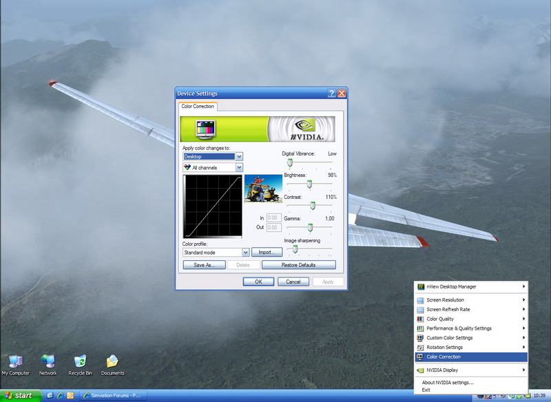
But I don't use those settings all the time; I only use it when I load the sim. I think that way my shots look a little nicer (at least to me ;)). Please take a look at my latest experiment and tell me what you see, what you like or even dislike (I know that plane is horrible, but the skin is really nice ;)) If you have any tips that you can share without giving away your secrets please feel free to do so :D

I still don't want to have the 'mine is bigger than yours' discussion ;) but in those shots I hardly see any distortion (or could it be that I'm just cleverly hiding in the clouds ::)) Or maybe I should try a yellow bird and fly over treetops? So ... what I'd like to put my finger on is, what we are doing different? Just to learn ...

As I'm im the middle of fiddling with my graphics cards' settings. I recently got a Gainward Bliss 7800 GS+ 512 and although I'm really happy with the performance, I'm still experimenting with it's capabilities. I believe that I set up my sim to (IMO) near perfection on my rig and I'm now trying to tweak the settings to get nicer shots.

I too use ACDSee for resizing, cropping, compressing etc. Great tool ... period.

I hope you can do something with this information ... I can't wait to read your reply in the morning!
User avatar
Harold
Lieutenant Colonel
Lieutenant Colonel
 
Posts: 5906
Joined: Wed Apr 12, 2006 5:13 am
Location: NL

Re: The colors of

Postby ramsa329 » Sun Nov 19, 2006 4:41 am

Harold:

I really am not in the habit of handing out critiques of people's screenshots.

This makes me very uncomfortable and I really don't like doing this.

But here goes and please remember that YOU ASKED.

I can tell immediately from your shots that your video card is not set-up correctly and that your Fs9.cfg is also set-up badly for that card you have.

and that there is no balance between the video card the .cfg and the settings in your sim

This can be seen in the overall lack of 3D quality and the general low level of scenery details.

In short they are are flat with very little depth.

Partly this is due to your positioning in relationship to  the light source.

There are no dramatics and the story is weak. They start in the middle of nowhere and go to the same place.

While there is no particular problem of clarity there also is no particular amount of clarity.

The edges and lines are all dull and in many cases wavey with very little definition and yes very smooth.

In fact so smooth it's like someone put vaseline on them.

The paint job by the designer is highly reflective yet somehow  you have managed to wipe that out with very poor control over your lighting and position.

You have whiteout on the engine naceles and on other parts where you are losing all detail and the pegasus decal looks like it needs a drink or somewhere else to go.

The cockpit windows are all dull with very low visibility and almost no reflection.

The shots are dry, they look like an exercise and don't look like they come from the heart.

There also appear to be some problems with the ground textures and some very weirdly positioned squares in shot #2 that pull the eye away and look bad.

The elevations in the mountains look flat as though the max vertex level in your .cfg is set incorrectly

The clouds are nice but they don't have any volume and again it seems that your settings have somehow affected and dulled out any depth of perception and shading.

The last shot is the best of them but it also lacks any dramatics or life. For this I would study Dave's scenery shots to quickly see the massive difference and it has nothing to with equipment.

The distortion in shot 4 serves no purpose it doesn't give a feeling of increased speed or of a special manuever because there is no real link to the sorroundings and it seem unnecessary and irrelevant.

The dark red is smeared in all the shots but can be especially seen in the rear views (I told you about this)

That's about it.

Now let me say this I told you I am uncomfortable with doing this.

I am well aware that I am not Mr Congeniality and popular like Fly2e or eno or others on this site.

Apparently I don't fit the definition of Mr Nice.... always calm and sweet like them.

and for this reason I try as much as possible to not critique their shots or anybody elses on this site.

I don't need or want every goody goody saint of proper behavior jumping down my throat about this post.

You asked and I answered period.
www.fs-gs.com
ramsa329
Major
Major
 
Posts: 1928
Joined: Mon Mar 18, 2002 1:11 am

Re: The colors of

Postby Harold » Sun Nov 19, 2006 1:42 pm

Now THAT is what I call feedback! I really enjoyed reading your comment and it strengthens my believe that I should get your advice on my settings. Like I said before it's just a matter of time before I'll call you ... I'm really curious what your suggestions are for balancing my cfg and videocard

You shouldn't feel uncomfortable giving criticizm like this, however you might want to consider tuning it down a notch and maybe give a couple of tips or solutions for the things that you don't like. But I don't have a problem with feedback like this ;) And the remark about the vaseline is hilarious!

I think you're right that there's no story to go with the shots but that is because I didn't make up one. I just posted the shots as I thought they were really nice. Very good and valid point; shots become much more interesting when there's a story to accompany them. I'll think about that next time I put up some shots!

So ... I hope you can give some tips to improve my shots and I'll post some of them afterwards.


Thank you Michael .. can't wait to read your reply.

Harold "where's the vaseline?" Kip
User avatar
Harold
Lieutenant Colonel
Lieutenant Colonel
 
Posts: 5906
Joined: Wed Apr 12, 2006 5:13 am
Location: NL

Re: The colors of

Postby ramsa329 » Sun Nov 19, 2006 7:35 pm

Harold,

I wasn't trying to be harsh just straightforward.

My favorite critics are people who tell it as they see it without "tuning it down" whether in sports, history, music or anything else.

In the past when I was a professional musician I had a lot of critiques written about me or said to me by record companies even on television. Some of them were very harsh and insulting but I had to go back to the studio, accept what they said, learn from it and do it again or no pay day.

A critique is not a walk in the park.

Had you askled me for tips (for free)
Last edited by ramsa329 on Sun Nov 19, 2006 7:45 pm, edited 1 time in total.
www.fs-gs.com
ramsa329
Major
Major
 
Posts: 1928
Joined: Mon Mar 18, 2002 1:11 am

Re: The colors of

Postby Harold » Mon Nov 20, 2006 6:04 pm

Hi Michael,

Of course I understand that you will not give away your secrets for free nor did I want to get your advice for free. I was just curious about what you would advise to improve my shots. Like you said, it's easy to criticize but without giving tips on how to improve any flaws, the criticizm is worthless.

As you said "contained within my posts are many many bits of info" but as I read "they are are flat with very little depth" and "this is due to your positioning in relationship to the light source" I don't see any suggestions to improve shots. I don't think you're giving away any FS-GS exclusive information when you would post some suggestions. I'm not asking you to tell me how to balance my system (like I said in a previous post: it's just a matter of time before I'll call you); I'm asking you to give some 'creativity tips' on how to get more depth, drama and light. I hope you understand ;)

I've tried Nick's Tips & Tricks and I must say I can really really see the difference with shots I made a couple of months ago. Let alone the smoothness of my sim. Still I'd like to see there's more ... and I when I compare my shots to Dave's or Andy's I know there is!

In addition, I find that your comment "they start in the middle of nowhere and go to the same place" also applies to your series with the Tiger Moth above. They start in the bush and end in the bush. Althought I find these shots really good with a nice color and quite dramatic I don't think you should critisize me for a series without a story. But that is a whole different discussion. Although you made a good point about posting shots as a storyboard.

So ... I think you should reconsider and post some suggestions! You might even want to pull your wife into this ;D


PS: I'm not a professional but I'm a mucisian too ... I've played guitar for nearly 20 years and over 10 years in the same band! So I understand where you're coming from. But I take it you were a studio musician and not performing your own songs as you said 'leave your personal opinion outside the studio door'. We never had that issue ;D

But we should jam if we'd ever get the chance ... what's your instrument?
User avatar
Harold
Lieutenant Colonel
Lieutenant Colonel
 
Posts: 5906
Joined: Wed Apr 12, 2006 5:13 am
Location: NL

Re: The colors of

Postby Fly2e » Mon Nov 20, 2006 7:23 pm

Michael plays the piano and his influences are centered around jazz..   8)
COMING SOON!
User avatar
Fly2e
Colonel
Colonel
 
Posts: 198020
Joined: Thu Jan 17, 2002 5:29 pm
Location: KFRG

Next

Return to Payware Screenshot Showcase

Who is online

Users browsing this forum: No registered users and 533 guests