Shore Patrol (The rework)

Let loose your artistic flair! No Rules except please keep shots within 380K & 2000 pixels wide.

Shore Patrol (The rework)

Postby eno » Sat May 15, 2010 4:16 am

I got some very good advice on another forum about improving this shot.

Image

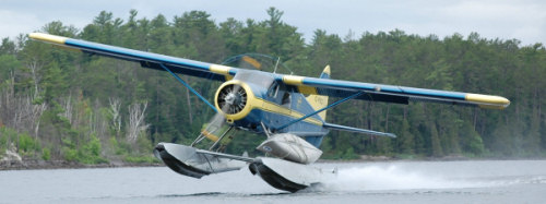
I took it ......... and this is the result...

Image

enjoy
eno
[align=center][img]http://www.simviation.com/yabbuploads/imaginsigeno.jpg[/img][/align]
User avatar
eno
Lieutenant Colonel
Lieutenant Colonel
 
Posts: 6708
Joined: Sun Jan 18, 2004 12:30 pm
Location: Derbyshire UK

Re: Shore Patrol (The rework)

Postby ShaneG_old » Sat May 15, 2010 5:34 am

I prefer the first one,  but I think mostly because you flipped the cliffs on the bottom one.
To me, it just seems to crowd the one side of the shot, where the top one seems more 'balanced'.

It's real hard to decide which version of the plane looks better.  I really like the color one, but the slight sepia tone on the bottom is perfect for the period.  8-)
ShaneG_old
Lieutenant Colonel
Lieutenant Colonel
 
Posts: 9700
Joined: Tue Mar 11, 2008 11:52 am

Re: Shore Patrol (The rework)

Postby patchz » Sat May 15, 2010 5:45 am

Ditto, I prefer the original.
Image
If God intended aircraft engines to have horizontally opposed engines, Pratt and Whitney would have made them that way.
User avatar
patchz
Colonel
Colonel
 
Posts: 10424
Joined: Wed Mar 11, 2009 7:33 pm
Location: IN THE FUNNY PAPERS

Re: Shore Patrol (The rework)

Postby B_7772 » Sat May 15, 2010 1:29 pm

If the original had the slight sepia tone, I'd prefer it over the rework.
B_7772


Return to Edited Screenshots

Who is online

Users browsing this forum: No registered users and 597 guests