Well I like no.2. The blue one. It's simple and a lot easier on the eyes. You might add a frame like no.1. Also you can read your name. It's not very legible in the brown ones. Just my opinion.
Last edited by Bob70 on Thu Mar 05, 2009 2:37 pm, edited 1 time in total.
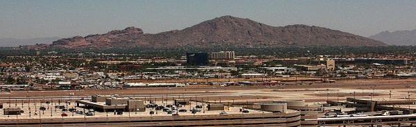
Camelback Mountain....Looking north from Sky Harbor Int.