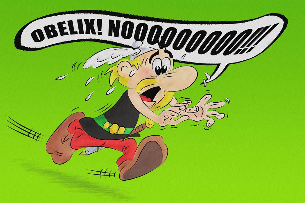

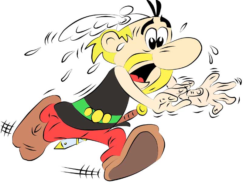
I've been on holiday.... and I decided to make something a little different. This picture took absolutely bloody ages to make but I learned a lot about PS and I'm quite happy with the result so - 12 hours well spent.
Here's a 'how I did it' for anyone who's interested.
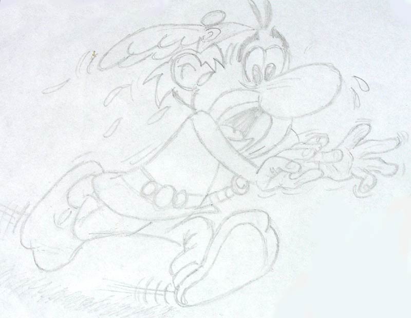
1. Freehand pencil sketch on paper, photographed and uploaded into my comp. I was was pleasantly surprised to find I could draw quite a good likeness, though there are errors, differences of course.
2. Lineart painstakingly placed over the top of the drawing using the vector pen tool - finally I've learned how to use it! It's great!
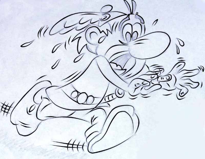
3. Coloured it in using a photo of the original pic so the colours are more or less as they should be. I found colouring using the mouse very difficult, so decided to use the paint tool. Unfortunately, the lineart style I used in part 2, with simulate pen pressure, of course left tons of gaps.... which I painstakingly again had to spend ages filling up with thin lines. I also added some bits I'd missed when drawing, like the sword.
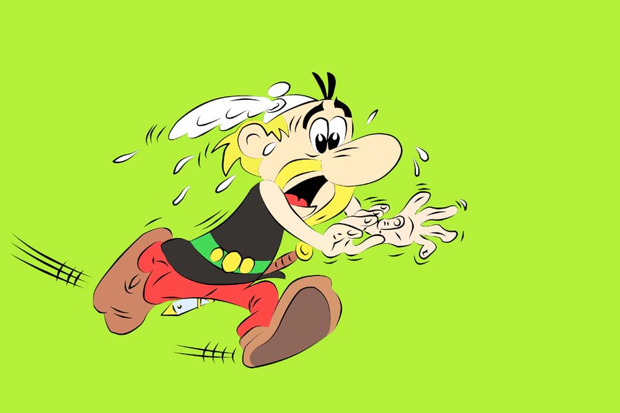
4. Put Asterix on a background.
5. Did some colouring, darkening and lightening, added a gradient somewhat like in the original pic, nothing too noticeable - I wanted it to look as close to the original as possible, with a bit of extra juice...
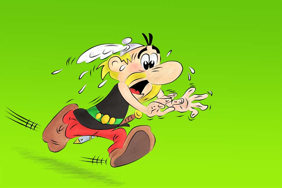
Finally, made the text using Impact and warped it - looks fairly like the original text, which is hand drawn I think. Put it in a speech bubble, selected and layer masked Asterix so it's behind him, made a couple of small colour adjustments and added a bit of noise. Finished.

 Cheers mate!
 ........