Simviation Forums
Flight Simulator and other chat
Flight Simulator and other chat
![]() by C » Fri Oct 26, 2007 4:48 pm
by C » Fri Oct 26, 2007 4:48 pm
![]() by jnc1 » Fri Oct 26, 2007 4:54 pm
by jnc1 » Fri Oct 26, 2007 4:54 pm
![]() by Mazza » Tue Oct 30, 2007 1:56 am
by Mazza » Tue Oct 30, 2007 1:56 am
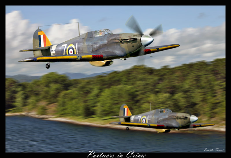
Very nice! Maybe just a little more adjustment on the modified letter "L -> E" on the one in the background (the bits you've added are a slightly different shade)...
![]() by a1 » Tue Oct 30, 2007 6:47 pm
by a1 » Tue Oct 30, 2007 6:47 pm

Users browsing this forum: No registered users and 396 guests