High Altitude

Let loose your artistic flair! No Rules except please keep shots within 380K & 2000 pixels wide.

High Altitude

Postby Tjw2 » Wed Jul 25, 2007 6:03 am

This is my first edit using a real background.

Image

comments would be greatly appreciated
Image
User avatar
Tjw2
2nd Lieutenant
2nd Lieutenant
 
Posts: 150
Joined: Wed Jan 17, 2007 12:01 am

Re: High Altitude

Postby Tjw2 » Wed Jul 25, 2007 6:23 pm

Ok i take this response as a bad sign
Image
User avatar
Tjw2
2nd Lieutenant
2nd Lieutenant
 
Posts: 150
Joined: Wed Jan 17, 2007 12:01 am

Re: High Altitude

Postby chrism7262 » Wed Jul 25, 2007 6:31 pm

nah i think its pretty neat!! if you're using photoshop though maybe you can either sharpen the valkyrie or blur it a little bit around the edges to make it look a little more realistic. nice job though!!
chrism7262
Captain
Captain
 
Posts: 697
Joined: Wed Jul 04, 2007 12:03 am
Location: Allentown, PA

Re: High Altitude

Postby Kleen Harry » Wed Jul 25, 2007 8:54 pm

Whoa! Easy there, M8!  ;) ;D :)

It's called a "composite image" and you just made your first! That is a major accomplishment and a major success in and of itself! You made it work! You did magic! Now you know that you can do it AND it's big fun!  :)

None of us start at the top, M8! We all start with our very first composite. "The journey of a thousand miles starts with the first step." It's a very good first composite, M8!

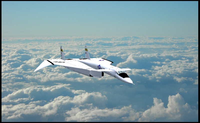
The major issue I see with it, which is to be expected in a first composite, is "blending". In other words, the plane looks pasted on to the background. That's pretty reasonable because it IS pasted on to the background, hee, hee!

For me, one of the most challenging aspects of composites is getting the aircraft to blend well with the background so that it appears natural. So, how to approach that problem? Well, start by looking at the image and make note of everything you see which causes the plane to appear separate and discrete from the background!

Some things to routinely look at are:

1) Color or hue.

2) Brightness and contrast.

3) Sharpness, unsharpness and roughness.

4) Inconsistencies in lighting.

Once you have your list, start working on those things. Tweak, tweak, tweak (non-drug type)! Mess around enough and you'll discover things and start to develop a feel for it. There's no way but to use your eyes and try tweaking things! It just takes time, experimentation and experience.  ;)

Which editor are you using, M8?
Kleen Harry
Captain
Captain
 
Posts: 950
Joined: Thu May 17, 2007 3:24 am

Re: High Altitude

Postby Tjw2 » Thu Jul 26, 2007 8:48 pm

Thanks for the tips now that i look at it it does look pasted  i use paint.net
Image
User avatar
Tjw2
2nd Lieutenant
2nd Lieutenant
 
Posts: 150
Joined: Wed Jan 17, 2007 12:01 am

Re: High Altitude

Postby NDSP » Fri Jul 27, 2007 8:06 am

Looks good man! Everything Harry said are things to definatly take into consideration. You should take a look at this cut-out tutorial for GIMP and get GIMP, because there is so much in GIMP you can do that you cant accomplish in Paint.net

Tutorial

GIMP

Nick
NDSP
Major
Major
 
Posts: 1879
Joined: Tue Dec 12, 2006 4:20 pm
Location: Queens, New York City


Return to Edited Screenshots

Who is online

Users browsing this forum: No registered users and 519 guests