by Kleen Harry » Sun Jun 17, 2007 10:34 am
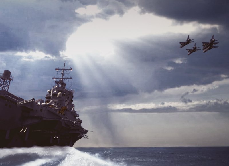
Well, the water looks pretty good to me, Brett! ;)
My subjective opinion is:
1) More midtones on the objects. They are mostly highight and shadow so a lot of detail is lost. If you so chose, you could either reduce the contrast on the ship and/or planes or not burn and dodge so much that the midtones are lost.
2) The sky looks a little rough, especially on the left. Sometimes it's tough to smooth things out without killing all of the definition and character. One trick is to use the "Elliptical Lasso", in a small circle of fixed size, and then apply a small amount of "Radial Blur". Too high a setting and you'll see a circle, hee, hee! Just move around to where ever things look too sharp. You can follow up with the "Blur" and "Smudge" tools as needed to get the final look you want.
3) You can use the "Show Grid" view to check for horizontal and vertical lines and then "Rotate Canvas" to square things up as much as possible.
All of these are, of course, options. It's up to the artist to decide what he likes best. That trumps everything else! :)