Simviation Forums
Flight Simulator and other chat
Flight Simulator and other chat
![]() by Double_Farvel » Wed Feb 21, 2007 3:35 pm
by Double_Farvel » Wed Feb 21, 2007 3:35 pm
![]() by Sytse » Wed Feb 21, 2007 4:39 pm
by Sytse » Wed Feb 21, 2007 4:39 pm

![]() by flymo » Thu Feb 22, 2007 7:18 am
by flymo » Thu Feb 22, 2007 7:18 am
![]() by Double_Farvel » Thu Feb 22, 2007 9:39 am
by Double_Farvel » Thu Feb 22, 2007 9:39 am
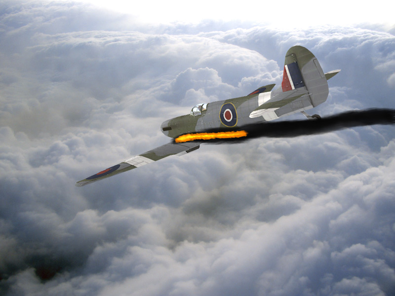
looks like you have used a pencil crayon
my tips would be
1.create your smoke first on one layer
2. on a new layer put a small bit of yellow and orrange (or whatever) where the fire is comeing from and smiudge it into shape
![]() by Immelman » Thu Feb 22, 2007 10:18 am
by Immelman » Thu Feb 22, 2007 10:18 am

![]() by Mictheslik » Thu Feb 22, 2007 11:55 am
by Mictheslik » Thu Feb 22, 2007 11:55 am
![]() by Ravang » Thu Feb 22, 2007 8:43 pm
by Ravang » Thu Feb 22, 2007 8:43 pm
Its good...but could be better. As said before, opacity down would be good. Also the flames don't look like they're in the right place to me.....could just be me though.
.mic

Users browsing this forum: No registered users and 212 guests