Rip it...

A workshop designed to help everyone improve their screenshot skills, featuring Simworld, the Screenart Gallery, tutorials, contests and much more!

Rip it...

Postby gottoflynow » Mon Oct 08, 2007 5:49 pm

My first rip it :D

Image

Do your thing...
Dell Dimension E520
Windows Vista Home Premium
Intel Core 2 Duo 6300 1.86 GHZ
2GB of ram
ATI Radeon X1300 Pro 256MB
Soundblaster Audigy 24bit Sound Card w/ Surround Sound Speakers  
160GB HD
User avatar
gottoflynow
Captain
Captain
 
Posts: 710
Joined: Mon Jan 09, 2006 7:07 pm

Re: Rip it...

Postby a1 » Mon Oct 08, 2007 5:55 pm

Good sense of speed. ;) Although A bit of land showing would make this look great. The clouds don't seemed to be deatiled.  ;) ;) Just do those things and the shot will look much better.
Image
790i : QX9650 : 4Gb DDR3 : GeForce 8800 GTX : 1 WD Raptor : 1 WD VelociRaptor 150
User avatar
a1
Lieutenant Colonel
Lieutenant Colonel
 
Posts: 7608
Joined: Thu Jan 04, 2007 9:16 pm

Re: Rip it...

Postby ThomasKaira » Mon Oct 08, 2007 6:11 pm

You asked for it. ;)

(First-Timer Notice: I do sound harsh, but it's for the better. I wish to tell you up close and personal exactly what I see that could make the shot better, and what is dragging it down.)

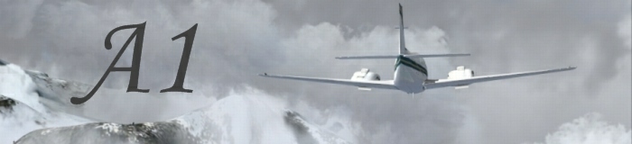
Airplane has plenty of "oomph" but that sense of "oomph" is being robbed by the boring angle for me. The angle you have on the plane is really nothing special, it does nothing for this screenie.

This being a "speed" shot, you have that sense of speed communicated quite nicely, but once again, the angle isn't doing much to help that sense.

There is nothing in the background except a huge wall of gray. This makes this shot look rather boring. Having recognizable landmarks or clouds can work wonders for the depth of a shot, this one, it is quite 2d. Speed really needs that third dimension so you can compare the moving object with the non-moving, in mine eyes.

Apart from the lack of an exciting angle to help back up the sense of speed and absence of a 3rd dimension, this shot is OK. Try to keep the solid gray clouds to a minimum in your screenshots, that can help them a lot. It makes for a much more eye-catching background.

Best of luck in you future endeavours. I hope my advice was helpful. :)
User avatar
ThomasKaira
Captain
Captain
 
Posts: 838
Joined: Thu Aug 02, 2007 9:29 pm
Location: Where Charlie Don't Surf

Re: Rip it...

Postby Clipper » Tue Oct 09, 2007 4:56 am

Try to think of your screenshots, particularly the ones you take time to set up, as words in a book. I think screenshots, as well as photographs have to read just like a good article in a magazine or story in a book. They have to make the viewer understand what's going on and provoke a personal opinion about the subject matter. If it doesn't, then an alternative way to create impressive screenshots may to add some shock value. A really unique perspective, a rarely used and ultra agressive zoom, colors that are original and curious to look at. Work on developing your own unique style in all your shots (remember Lemoncat?). Might be the type of aircraft you use, or your use of clouds..something that consistantly seperates you from everyone else. People should almost always be able to look at your screens and know they're yours without seeing your name attached to it. Not an easy task, but if accomplished, your profile as a screenartist will shine brightly.
Last edited by Clipper on Wed Oct 10, 2007 5:30 am, edited 1 time in total.
Image
User avatar
Clipper
Global Moderator
Global Moderator
 
Posts: 8420
Joined: Tue Aug 23, 2005 5:40 am


Return to Studio V Screenshot Workshop

Who is online

Users browsing this forum: No registered users and 237 guests