SimV Flying Club logo

A workshop designed to help everyone improve their screenshot skills, featuring Simworld, the Screenart Gallery, tutorials, contests and much more!

SimV Flying Club logo

Postby Cessna93 » Wed Aug 01, 2007 3:55 pm

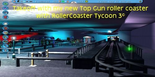
I decided to give a go at attempting a logo for the flying club.

Its not much but I can do a better one if needed, this was jsut a quick whip up.

[url=http://www.simviation.com/yabbuploads/SimVFC.jpg][img]
http://www.simviation.com/yabbuploads/S ... MBNAIL.jpg[/img][/url]

Click for a biggy  ;)
Last edited by Cessna93 on Wed Aug 01, 2007 3:59 pm, edited 1 time in total.
Image
User avatar
Cessna93
1st Lieutenant
1st Lieutenant
 
Posts: 387
Joined: Sun May 27, 2007 10:14 am
Location: United Kingdom, Wickwar

Re: SimV Flying Club logo

Postby john_uk » Wed Aug 01, 2007 4:04 pm

not quite what i had in mind. good try though :)
john_uk
 

Re: SimV Flying Club logo

Postby Harold » Thu Aug 02, 2007 3:39 am

It made me look twice ... I thought you forgot the S :-?

I am a Sales and Marketing Manager and deal with a lot of concepts like this.
Remember that your target audience has to immediately see what it is and that it has to make a clear statement.

Overall I think it is to artsy ... and I think you should make it more to the point.

If you want to discuss some concepts you know where to find me ;)


P.S. I thought Double_Farvel's logo for the flying club was the best thing I've seen so far.
Only the the flying club characters could be more italic so that the alighn with the Simviation characters

Image
Last edited by Harold on Thu Aug 02, 2007 3:46 am, edited 1 time in total.
User avatar
Harold
Lieutenant Colonel
Lieutenant Colonel
 
Posts: 5906
Joined: Wed Apr 12, 2006 5:13 am
Location: NL

Re: SimV Flying Club logo

Postby Double_Farvel » Thu Aug 02, 2007 7:34 am

It made me look twice ... I thought you forgot the S :-?

I am a Sales and Marketing Manager and deal with a lot of concepts like this.
Remember that your target audience has to immediately see what it is and that it has to make a clear statement.

Overall I think it is to artsy ... and I think you should make it more to the point.

If you want to discuss some concepts you know where to find me ;)


P.S. I thought Double_Farvel's logo for the flying club was the best thing I've seen so far.
Only the the flying club characters could be more italic so that the alighn with the Simviation characters

Image

Thanks Harold! I really appreciate that!  :D

Yes, I also had to look around even to find the S in Simviation. Like Harold was saying, its a bit abstract, but creative.
Last edited by Double_Farvel on Thu Aug 02, 2007 7:35 am, edited 1 time in total.
Image
User avatar
Double_Farvel
Major
Major
 
Posts: 1073
Joined: Fri Aug 11, 2006 5:06 am
Location: New Jersey, USA


Return to Studio V Screenshot Workshop

Who is online

Users browsing this forum: No registered users and 254 guests