http://www.simviation.com/cgi-bin/yabb2 ... 1173000406


Improving? What can I improve more?
Flight Simulator and other chat
![]() by DizZa » Wed Mar 07, 2007 5:16 am
by DizZa » Wed Mar 07, 2007 5:16 am
![]() by Helms » Wed Mar 07, 2007 7:57 am
by Helms » Wed Mar 07, 2007 7:57 am
![]() by matt2190 » Wed Mar 07, 2007 8:08 am
by matt2190 » Wed Mar 07, 2007 8:08 am

![]() by krigl » Wed Mar 07, 2007 10:08 am
by krigl » Wed Mar 07, 2007 10:08 am
![]() by Immelman » Wed Mar 07, 2007 4:42 pm
by Immelman » Wed Mar 07, 2007 4:42 pm

![]() by CSM » Thu Mar 08, 2007 4:22 am
by CSM » Thu Mar 08, 2007 4:22 am
![]() by krigl » Thu Mar 08, 2007 6:24 am
by krigl » Thu Mar 08, 2007 6:24 am
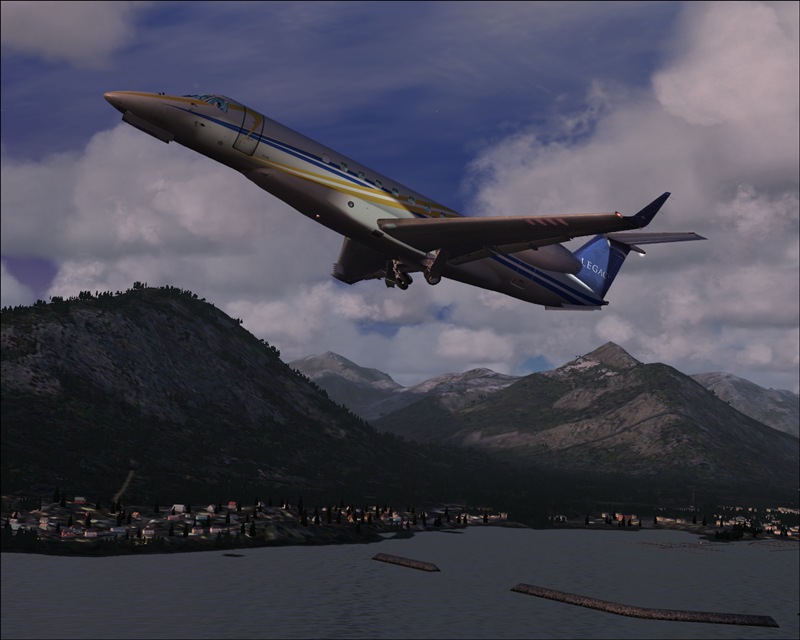
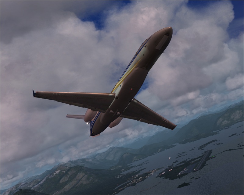
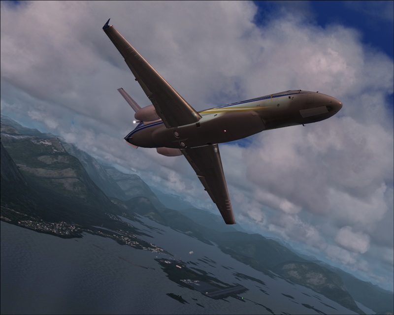
Those are great shots. The only thing I can say is get some different angles. The last three are almost the same angle.
Return to Studio V Screenshot Workshop
Users browsing this forum: No registered users and 305 guests