A workshop designed to help everyone improve their screenshot skills, featuring Simworld, the Screenart Gallery, tutorials, contests and much more!
 by Helms » Fri Mar 02, 2007 3:25 pm
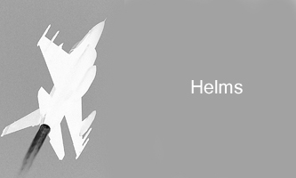
My first try at a composite.

Josh
-
Helms
- Captain

-
- Posts: 586
- Joined: Mon Jun 05, 2006 10:28 am
- Location: Elk Creek, Nebraska
by Alonso » Fri Mar 02, 2007 4:05 pm
Not bad at all.. nice job.
Maybe adding NAV lights would be better.. Well and Delta airlines scheme isn't the most attractive


Core i5 2500k @ 3.8 - 8GB DDR3 - GTX 560 OC
-
Alonso
- Major

-
- Posts: 2828
- Joined: Fri Apr 21, 2006 7:13 pm
- Location: Lima, Peru
by FSGT Gabe » Fri Mar 02, 2007 5:17 pm
Looks pretty good for a first try I'd say

.
- Kevin

 Studio V - Your destination for all your screenshot needs...
[move][color=#000066]Wi
-

FSGT Gabe
- Major
-
- Posts: 1576
- Joined: Tue May 16, 2006 10:44 am
- Location: Home airport: CYOO
by Sytse » Fri Mar 02, 2007 8:29 pm
Looking good, Josh! Don't know what's going on exactly in the lower left corner though...
Keep it up! :)
-

Sytse
- Major
-
- Posts: 3397
- Joined: Fri Jun 24, 2005 5:26 am
- Location: The Netherlands
-
by Double_Farvel » Fri Mar 02, 2007 9:18 pm
Nice, but you should try to pick high resolution photos for backrounds. These look much better in composites and usually aren't compressed as much. Other than that, it looks good. ;)
-

Double_Farvel
- Major
-
- Posts: 1073
- Joined: Fri Aug 11, 2006 5:06 am
- Location: New Jersey, USA
Return to Studio V Screenshot Workshop
Who is online
Users browsing this forum: No registered users and 239 guests