Simviation Forums
Flight Simulator and other chat
Flight Simulator and other chat
![]() by krigl » Tue Feb 27, 2007 12:38 pm
by krigl » Tue Feb 27, 2007 12:38 pm
![]() by fabiane » Tue Feb 27, 2007 2:01 pm
by fabiane » Tue Feb 27, 2007 2:01 pm
![]() by takis63 » Tue Feb 27, 2007 2:38 pm
by takis63 » Tue Feb 27, 2007 2:38 pm

![]() by Mythical » Tue Feb 27, 2007 4:02 pm
by Mythical » Tue Feb 27, 2007 4:02 pm

![]() by Scudrunners » Tue Feb 27, 2007 5:56 pm
by Scudrunners » Tue Feb 27, 2007 5:56 pm

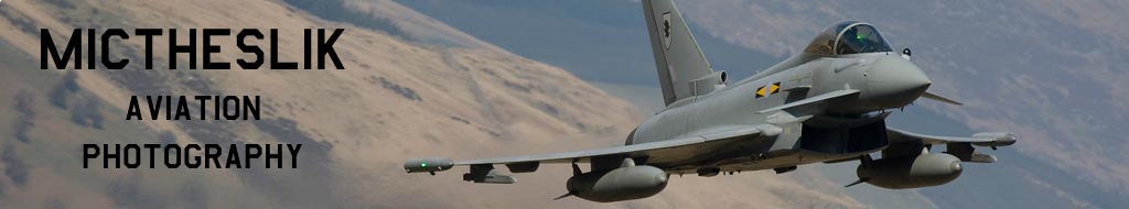
![]() by Mictheslik » Tue Feb 27, 2007 6:00 pm
by Mictheslik » Tue Feb 27, 2007 6:00 pm
My comments:
1. The best one
2. All out of proportion, bland
3. Sorry but that yellow tint sucks.
4. Nice sky, nice runway, but the airplane is out of proportion and you can only see a small portion of it.
5. Too Dark and Too Pink.
6. Scenery too dark
7. No scenery, bland scenery, too many straight lines in what little scenery that is there.
8. this could be my second choice but I don't really care for partial cockpit shots.

 )
)
![]() by ThatOnePerson » Tue Feb 27, 2007 6:01 pm
by ThatOnePerson » Tue Feb 27, 2007 6:01 pm
 Its an honor to be a finalist, especially against so many other awesome entries

![]() by alrot » Tue Feb 27, 2007 7:53 pm
by alrot » Tue Feb 27, 2007 7:53 pm
My comments:
1. The best one
2. All out of proportion, bland
3. Sorry but that yellow tint sucks.
4. Nice sky, nice runway, but the airplane is out of proportion and you can only see a small portion of it.
5. Too Dark and Too Pink.
6. Scenery too dark
7. No scenery, bland scenery, too many straight lines in what little scenery that is there.
8. this could be my second choice but I don't really care for partial cockpit shots.
 Wait a minute you can't ................... :-/ the first ....1=alrot {if} alrot=me :o.. wait!!..
  : Hiii Scudrunners from now on you are one of my best friends..............
  ROFLMAO
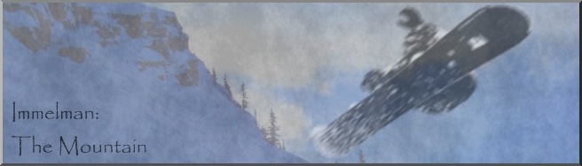
 ![]() by Immelman » Tue Feb 27, 2007 8:10 pm
by Immelman » Tue Feb 27, 2007 8:10 pm
Is it just me or has someone cut the nose of Lazerbeaks shot though

![]() by Ravang » Tue Feb 27, 2007 9:13 pm
by Ravang » Tue Feb 27, 2007 9:13 pm
good luck to everyone 
![]() by Cobra » Wed Feb 28, 2007 6:59 am
by Cobra » Wed Feb 28, 2007 6:59 am
No, you just have to scroll to the right a little bit and you can see it.
I'll shut up now 
![]() by stick4000 » Wed Feb 28, 2007 7:22 am
by stick4000 » Wed Feb 28, 2007 7:22 am

![]() by Scudrunners » Wed Feb 28, 2007 8:25 am
by Scudrunners » Wed Feb 28, 2007 8:25 am
My comments:
1. The best one
2. All out of proportion, bland
3. Sorry but that yellow tint sucks.
4. Nice sky, nice runway, but the airplane is out of proportion and you can only see a small portion of it.
5. Too Dark and Too Pink.
6. Scenery too dark
7. No scenery, bland scenery, too many straight lines in what little scenery that is there.
8. this could be my second choice but I don't really care for partial cockpit shots.
new concept...lets criticize everybodys shots and reveal who you voted for
great quality as usual guys....all are stunning. I'm very honoured to be in the finals again....(no arguing this time though
.mic
![]() by kingmarktheaviator » Wed Feb 28, 2007 9:59 am
by kingmarktheaviator » Wed Feb 28, 2007 9:59 am
![]() by Jon H » Wed Feb 28, 2007 10:21 am
by Jon H » Wed Feb 28, 2007 10:21 am

Return to Studio V Screenshot Workshop
Users browsing this forum: No registered users and 200 guests