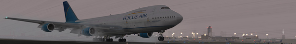
Trying a composite...

A workshop designed to help everyone improve their screenshot skills, featuring Simworld, the Screenart Gallery, tutorials, contests and much more!

Trying a composite...

Postby FSGT Gabe » Sat Feb 10, 2007 11:57 am

Hey guys,

I'm working on this composite for an edit this competition over at screenshotart.com.
Image
Studio V - Your destination for all your screenshot needs...
[move][color=#000066]Wi
User avatar
FSGT Gabe
Major
Major
 
Posts: 1576
Joined: Tue May 16, 2006 10:44 am
Location: Home airport: CYOO

Re: Trying a composite...

Postby Double_Farvel » Sat Feb 10, 2007 12:45 pm

Not bad, although the planes are too close together. Other than that its good. ;)
Image
User avatar
Double_Farvel
Major
Major
 
Posts: 1073
Joined: Fri Aug 11, 2006 5:06 am
Location: New Jersey, USA

Re: Trying a composite...

Postby Mees » Sat Feb 10, 2007 1:27 pm

I like the idea, but theres no lightning on the plane and the 2nd one seems cutted out quite roughly.
Image
AMD Athlon 4200+ :: Gigabyte K8n-SLi :: 1GB RAM :: 7900GTX 512MB
User avatar
Mees
Major
Major
 
Posts: 3659
Joined: Fri Aug 05, 2005 10:08 am
Location: Netherlands, the

Re: Trying a composite...

Postby FSGT Gabe » Sat Feb 10, 2007 1:31 pm

Not bad, although the planes are too close together.


So you recommend I move them farther apart?

I like the idea, but theres no lightning on the plane and the 2nd one seems cutted out quite roughly.


What do you mean?  The planes are too dark?  Or they have no lights...?  And which is cut out roughly (I'm not blind...just not observant :P).

Thanks for the help guys!  Keep it up!

- Kevin :D
Image
Studio V - Your destination for all your screenshot needs...
[move][color=#000066]Wi
User avatar
FSGT Gabe
Major
Major
 
Posts: 1576
Joined: Tue May 16, 2006 10:44 am
Location: Home airport: CYOO

Re: Trying a composite...

Postby Sytse » Sun Feb 11, 2007 4:55 am

Yes, you should move the planes further apart. I'd also add some more lighting on the planes (Light falling on the planes from the sun). Use a small yellow brush set to colour dodge around the edges. Yellow, because I think the lighting on the planes is too blue, compared to the light from the sun. Also, touch up the canopies. Try BananaBob's canopy tutorial over at sceenshotart.com. You could also add a burner effect.

Good luck in the competition!  ;)
User avatar
Sytse
Major
Major
 
Posts: 3397
Joined: Fri Jun 24, 2005 5:26 am
Location: The Netherlands

Re: Trying a composite...

Postby FSGT Gabe » Sun Feb 11, 2007 3:25 pm

[quote]Yes, you should move the planes further apart. I'd also add some more lighting on the planes (Light falling on the planes from the sun). Use a small yellow brush set to colour dodge around the edges. Yellow, because I think the lighting on the planes is too blue, compared to the light from the sun. Also, touch up the canopies. Try BananaBob's canopy tutorial over at sceenshotart.com. You could also add a burner effect.

Good luck in the competition!
Image
Studio V - Your destination for all your screenshot needs...
[move][color=#000066]Wi
User avatar
FSGT Gabe
Major
Major
 
Posts: 1576
Joined: Tue May 16, 2006 10:44 am
Location: Home airport: CYOO

Re: Trying a composite...

Postby Sytse » Sun Feb 11, 2007 5:36 pm

Just select a normal brush and set the blending mode (toolbar) to colour dodge. Use a small brush, about 40% hardness and about 8% opacity. That should do the trick... ;)
User avatar
Sytse
Major
Major
 
Posts: 3397
Joined: Fri Jun 24, 2005 5:26 am
Location: The Netherlands

Re: Trying a composite...

Postby FSGT Gabe » Mon Feb 12, 2007 9:01 am

Thanks Syste I'll try that when I get the chance ;).

- Kevin :D
Image
Studio V - Your destination for all your screenshot needs...
[move][color=#000066]Wi
User avatar
FSGT Gabe
Major
Major
 
Posts: 1576
Joined: Tue May 16, 2006 10:44 am
Location: Home airport: CYOO


Return to Studio V Screenshot Workshop

Who is online

Users browsing this forum: No registered users and 199 guests