Screenshot Critiques

A workshop designed to help everyone improve their screenshot skills, featuring Simworld, the Screenart Gallery, tutorials, contests and much more!

Screenshot Critiques

Postby Clipper » Sat Jan 13, 2007 1:27 pm

Image

Screenshot Critiques is designed for you to post your screenshot (1 pic at a time per person please) and ask others for their opinions, suggestions and general comments. So try it out...post a pic here as a reply, with your "critique" request, and see where it stands. Please post your screenshot as a clickable thumbnail if you can. Don't forget to name the person whose pic you're analyzing in your responses..
Last edited by Clipper on Thu Jan 18, 2007 10:00 pm, edited 1 time in total.
Image
User avatar
Clipper
Global Moderator
Global Moderator
 
Posts: 8420
Joined: Tue Aug 23, 2005 5:40 am

Re: Screenshot Critiques

Postby Immelman » Sat Jan 13, 2007 5:49 pm

An edit of an F-18 at night.

Image

Critique, critizize, and suggest.
Last edited by Immelman on Sat Jan 13, 2007 5:50 pm, edited 1 time in total.
User avatar
Immelman
1st Lieutenant
1st Lieutenant
 
Posts: 409
Joined: Sat Jun 03, 2006 7:37 pm

Re: Screenshot Critiques

Postby 9thSimplex » Sat Jan 13, 2007 7:35 pm

Hello Immelmann,

I don'T know if I, as no studioV member, am allowed to post here but I want to congratualte you for your decission to put your work to the critic eyes of others. I've seen lots of such threads in other forums and there was always a warning in the opening post that you should be able to see the benefit of it rather than getting annoyed if a critic sounds too harsh what surely might happen sooner or later. Hats off!

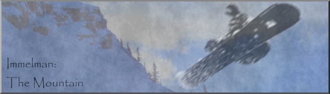
Now for your artwork, I do like the colors in this image I must admit im not too fond of the soft corona around the plane here. Would it be at parts being exposed to bright light or something like that it would be something different but they don'T add to the shot here imho. Why not adding some projected shadows instead? I think they would be more benefical to underline some moonlight iluminating the plane's belly which went up. Furthermore I think the plane is just a tad bit too close to the left image border giving it a slightly uncomfortable feeling, for me at last.

So much for some pointers from me. I hope they help you and I'd like to hear your ideas regarding my comments.
If you like screenshots you might check
Image
User avatar
9thSimplex
2nd Lieutenant
2nd Lieutenant
 
Posts: 154
Joined: Wed Dec 21, 2005 10:50 pm
Location: Eurospeedway Lausitzring, GER

Re: Screenshot Critiques

Postby Theis » Sun Jan 14, 2007 3:52 am

Hello Immelmann,

I don't know if I, as no Studio V member, am allowed to post here

Hey, everyone on SimV is allowed to post here.  :)
You don't have to be a Studio V member to do so, and by your critiques, I can see, that you are worthy to post here :) ;)

Cheers Theis
Image Bar by Mees
Image
User avatar
Theis
Major
Major
 
Posts: 4846
Joined: Tue Sep 14, 2004 6:16 am
Location: Denmark

Re: Screenshot Critiques

Postby Immelman » Sun Jan 14, 2007 11:51 am

Thanks for your help simplex.  Those comments were very useful and ill try to keep them in mind for next time.
User avatar
Immelman
1st Lieutenant
1st Lieutenant
 
Posts: 409
Joined: Sat Jun 03, 2006 7:37 pm

Re: Screenshot Critiques

Postby ThatOnePerson » Thu Jan 18, 2007 1:20 pm

Ill give it a go :)

Image

Any better than my last one?
Image

"Float like Pissed-Off Butterfly, Sting like Bad-Ass Bee."
ThatOnePerson
Major
Major
 
Posts: 1854
Joined: Sun Jun 05, 2005 11:42 pm
Location: The Blue Planet

Re: Screenshot Critiques

Postby Souichiro » Thu Jan 18, 2007 4:13 pm

Yup it certainly is! looks way more natural!
Image
User avatar
Souichiro
Ground hog
Ground hog
 
Posts: 0
Joined: Tue Aug 28, 2007 11:34 am

Re: Screenshot Critiques

Postby Souichiro » Thu Jan 18, 2007 4:17 pm

here's my shot to critsize!... rip her up!


Image
Image
User avatar
Souichiro
Ground hog
Ground hog
 
Posts: 0
Joined: Tue Aug 28, 2007 11:34 am

Re: Screenshot Critiques

Postby Harold » Thu Jan 18, 2007 4:45 pm

rip her up!


Really??  ::) ;D
Last edited by Harold on Thu Jan 18, 2007 4:46 pm, edited 1 time in total.
User avatar
Harold
Lieutenant Colonel
Lieutenant Colonel
 
Posts: 5906
Joined: Wed Apr 12, 2006 5:13 am
Location: NL

Re: Screenshot Critiques

Postby Clipper » Thu Jan 18, 2007 9:59 pm

Soui, For some reason that light style doesn't do it for me. The ground textures could use a bit more detailing, but overall I like the pic. In my opinion, whenever an aircraft is the predominant focal point in a pic featuring both scenery and aircraft, the pic becomes much more realistic and visually appealing.
Would be interesting to see the same scenery, same aircraft but with the jet recessed way back in the pic allowing the scenery to become the main focal point. Would make an interesting visual tutorial seeing the two perspectives side by side don't you think?  :)
Image
User avatar
Clipper
Global Moderator
Global Moderator
 
Posts: 8420
Joined: Tue Aug 23, 2005 5:40 am

Re: Screenshot Critiques

Postby Sytse » Fri Jan 19, 2007 3:34 am

Soui, your shot has all ingredients for a good screenshot. The problem is that it doesn't work, at least to me it doesn't... I think there's just too much going on. The nice looking Eagle, the bright burner, the nav lights, the wild angle, the zoom, the scenery, the clouds, the banked horizon... Everything seems to be screeming: "Look at me!! Look at me!!"
My eye just doesn't find a place to rest in this pic. It keeps jumping from one point to another. Try to get some peace in the picture.
User avatar
Sytse
Major
Major
 
Posts: 3397
Joined: Fri Jun 24, 2005 5:26 am
Location: The Netherlands

Re: Screenshot Critiques

Postby DizZa » Fri Jan 19, 2007 9:29 am

Image
Last edited by DizZa on Fri Jan 19, 2007 9:32 am, edited 1 time in total.
DizZa
 

Re: Screenshot Critiques

Postby FSGT Gabe » Fri Jan 19, 2007 9:53 am

Conquistador, that plane looks beautiful!  The lighting is very serene...but the shot is way too plain :'(
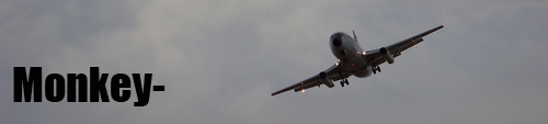
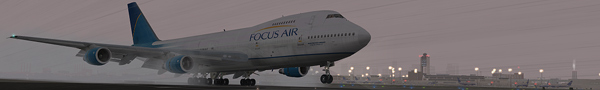
.  What would make this shot better is interesting clouds in the background - right now it looks like it on a white background almost :-X.  That's my thought.

- Kevin ;D
Image
Studio V - Your destination for all your screenshot needs...
[move][color=#000066]Wi
User avatar
FSGT Gabe
Major
Major
 
Posts: 1576
Joined: Tue May 16, 2006 10:44 am
Location: Home airport: CYOO

Re: Screenshot Critiques

Postby Sytse » Fri Jan 19, 2007 12:27 pm

Conquizdor,

I have to agree sgt. Gabe. I do think it's a nice base to start from. However, if you're going for this kind of shot, you should zoom in more on the aircraft. Also, I see that you have edited the shot. Adding a prop would really improve the shot and why not play around with the colours a bit? The blue colour is nice, but the shot could use a bit more variation. Click my signature for more tips on editing. ;)
User avatar
Sytse
Major
Major
 
Posts: 3397
Joined: Fri Jun 24, 2005 5:26 am
Location: The Netherlands

Re: Screenshot Critiques

Postby Mees » Fri Jan 19, 2007 3:34 pm

Looks like I'm going for a spin in PSS Concorde Tom!!!
Image
AMD Athlon 4200+ :: Gigabyte K8n-SLi :: 1GB RAM :: 7900GTX 512MB
User avatar
Mees
Major
Major
 
Posts: 3659
Joined: Fri Aug 05, 2005 10:08 am
Location: Netherlands, the

Next

Return to Studio V Screenshot Workshop

Who is online

Users browsing this forum: No registered users and 139 guests