I reworked these two bpbs as well...

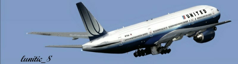
...what a lovely place to crash-land a Caravan.

Cheers
Krigl
Flight Simulator and other chat
![]() by krigl » Mon Nov 24, 2008 4:45 pm
by krigl » Mon Nov 24, 2008 4:45 pm
![]() by ShaneG_old » Mon Nov 24, 2008 4:48 pm
by ShaneG_old » Mon Nov 24, 2008 4:48 pm
 HOLY HELL MAN!!!! Beginners stuff?!?! :-? These make my best edits look like preschool finger paintings.
![]() by gtirob01 » Mon Nov 24, 2008 11:16 pm
by gtirob01 » Mon Nov 24, 2008 11:16 pm
![]() by eno » Tue Nov 25, 2008 6:09 am
by eno » Tue Nov 25, 2008 6:09 am
![]() by krigl » Thu Nov 27, 2008 3:02 am
by krigl » Thu Nov 27, 2008 3:02 am
Great stuff................from a beginner?
![]() by Rich H » Thu Nov 27, 2008 2:53 pm
by Rich H » Thu Nov 27, 2008 2:53 pm

![]() by JLangholzJ » Fri Nov 28, 2008 12:07 am
by JLangholzJ » Fri Nov 28, 2008 12:07 am


![]() by jime59 » Fri Nov 28, 2008 1:54 am
by jime59 » Fri Nov 28, 2008 1:54 am

![]() by krigl » Fri Nov 28, 2008 5:18 am
by krigl » Fri Nov 28, 2008 5:18 am
No offence meant,was being a little cynical that's all. I hope you didn't take it the wrong way.
If/when I give it a go at editing I'm sure you'll see the difference between a beginner(me) and what you've accomplished so far. Which is outstanding work,be it a beginner or a pro.
Users browsing this forum: No registered users and 371 guests