Thank you for your help!
WJI, that's a good suggestion that I tried. The early versions of the ATI drivers leave the ATC font as it should be, but FS crashes fairly regularly. It's only with the newer versions of the Catalyst Drivers that font has started to garble in places. With the previous version of my drivers, it was a lot worse - all file and folder names just looked very distorted, which thankfully they don't with the newest release. The entry in the MS knowledge base went a bit over my head!
Phantomflyer - thanks for hunting around, I really appreciate it. There's nothing available to me in terms of font smoothing, and I don't get any font irregularites when i write anything in word etc. The only time font appears like this is if it already present in a program, like a File or Edit menu, or something simular. Interestingly enough, while checking around on the graphics card utility, it occured in the menu there -
This made me think that perhaps the issue occurs when this particular font style is used. From what I can see, the fonts in the ATC screenie and the one just above look like they could be the same one.
 I'm new, in case you didn't notice.
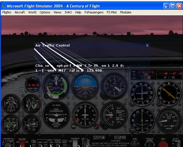


 PhotoShop 7 user