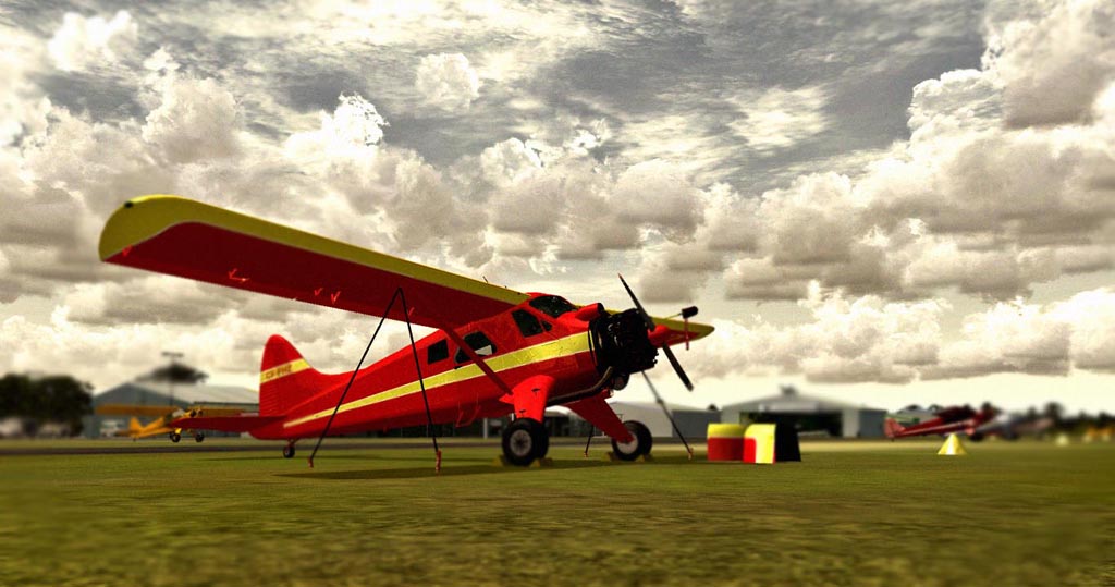
2 things kind of stand out to me that take away from the shot.
- A little too heavy on the blur, when it gets that blurry, it looses that depth and just becomes 'muddy'. It achieves your goal of drawing the viewers focus to the main subject, but the extremity of the blur also draws attention to itself.

-compression hates solid blues, reds, & yellows, and as you can tell, really takes away from the detailing on the plane, and causes it to have a 'colored in with crayons' appearance.
Aside from that, I like the setup & the angle. Your skies are always beautiful & dramatic, and the selection of planes in this shot is excellent.
Looking forward to seeing your next shot.