by an-225 » Wed Aug 29, 2007 4:39 am
OK, I will be truthful here.
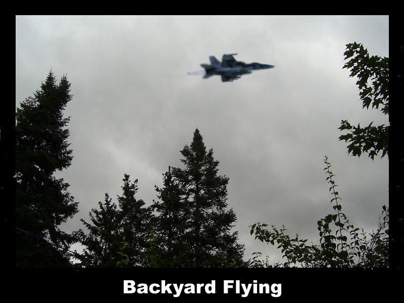
I don't like them. All I see, is the original picture with a filter/effect slapped on. The first, is a good start in the world of composites (two images blended together). Like you said, it is a little too blurred, if I were you, I would blur the plane a little less, or blur the background (slightly) to give it a sense of speed.
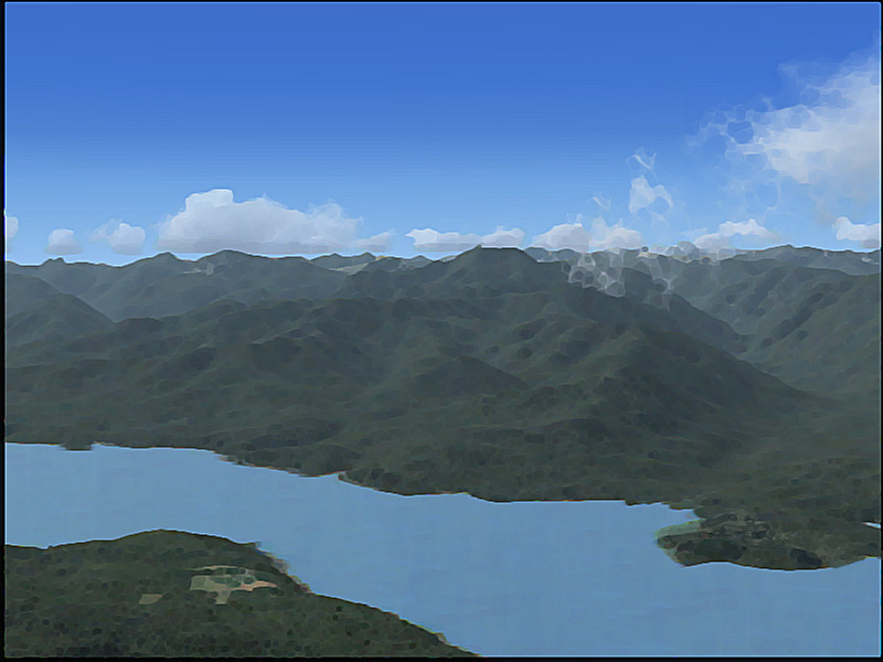
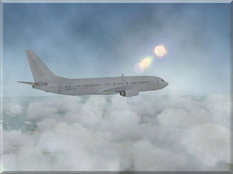
There really is nothing edited in the second apart from the filter edit. I don't quite see what the aim was for this picture, perhaps, leave out the mosaic effect next time, and work on enhancing the picture in general (lighting, colour etc.). This applies to the third aswell. Leave out the watercolour, and enhance it like the second one.
Last edited by an-225 on Wed Aug 29, 2007 4:41 am, edited 1 time in total.
 )
)