 by Kleen Harry » Tue May 22, 2007 6:32 pm
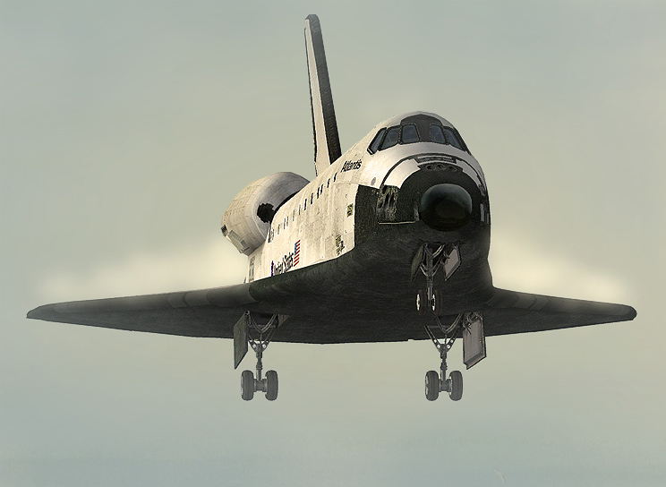
Very, very nice, Cobra! You have a really good eye for composition! :)
I'll be the "odd man out" and go with #2. Why?
1) I really like the soft, misty look to the background. Just seems more "artistic" to my eye.
2) The softer background doesn't compete for attention with the subject in #2. Orange is the MOST dominant color of all. That, plus having the shuttle on the launcher very sharp and clear, results in my eye being pulled over there even more than it is pulled to the aircraft in flight! In #2, the orange seems to be "muted" to just the right degree! My attention stays primarily on the subject.
I really like the water and the birds and the whole composition is very well balanced, IMHO!
Hope to see more from you soon! Great work! 8-)


