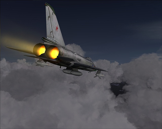
The original:
Part of this was also used:
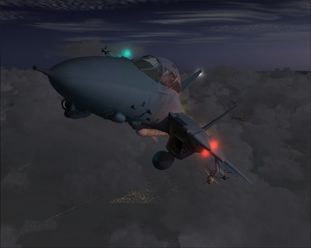
My comic result:

Thanks for looking and please remember to tell me what you think...
Flight Simulator and other chat
![]() by MOUSY » Sun Apr 22, 2007 2:23 am
by MOUSY » Sun Apr 22, 2007 2:23 am
![]() by krigl » Sun Apr 22, 2007 2:55 pm
by krigl » Sun Apr 22, 2007 2:55 pm
![]() by MOUSY » Mon Apr 23, 2007 4:48 pm
by MOUSY » Mon Apr 23, 2007 4:48 pm


Users browsing this forum: No registered users and 553 guests