Critique Pt.2

A workshop designed to help everyone improve their screenshot skills, featuring Simworld, the Screenart Gallery, tutorials, contests and much more!

Critique Pt.2

Postby Tom... » Mon Jan 14, 2008 2:09 pm

Scene as the lighting in my last shot was the thing that most people though was really good i decided to go out and get another shot with the emphisis on lighting

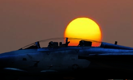
(Click for high res)

[url=http://img178.imageshack.us/img178/4530/hunt6largedl8.jpg[/url]Image[/url]

Original

Image

Tom
Last edited by Tom... on Mon Jan 14, 2008 2:10 pm, edited 1 time in total.
Image
User avatar
Tom...
1st Lieutenant
1st Lieutenant
 
Posts: 354
Joined: Tue Jan 16, 2007 5:29 pm
Location: Suffolk

Re: Critique Pt.2

Postby Ashar » Mon Jan 14, 2008 2:30 pm

The plane's way too orange for my taste :-/

Unfortunately, I'm not a big fan of psychedelic colors :-/
Last edited by Ashar on Mon Jan 14, 2008 2:59 pm, edited 1 time in total.
Blabbing Away at SimV Since June 8, 2004
Ashar
Major
Major
 
Posts: 4041
Joined: Wed Mar 14, 2007 4:13 am
Location: Ottawa, Ontario

Re: Critique Pt.2

Postby cspyro21 » Mon Jan 14, 2008 2:40 pm

The lighting isn't too realistic, but it makes for a VERY nice edit indeed! 8-) 8-)
User avatar
cspyro21
Major
Major
 
Posts: 4987
Joined: Sun Aug 28, 2005 6:11 am

Re: Critique Pt.2

Postby spitfire boy » Mon Jan 14, 2008 4:45 pm

If this was an edit intended to look real, it'd score badly. However, it clearly isn't intended to look real, so it scores very highly... ;D

Seriously, I love the colours in this; the exaggeration is what makes it for me. :D
Image


[center]
User avatar
spitfire boy
Major
Major
 
Posts: 2587
Joined: Mon May 21, 2007 4:46 pm
Location: Wherever you think I'm not

Re: Critique Pt.2

Postby JLangholzJ » Mon Jan 14, 2008 8:49 pm

I don;t use photoshop, istead i prefer gimp, but thier relatively that same.

From the looks of your previous pictures, you are editing the whole picture at once. Why not try adding several layers so you could edit the plane and clouds sperately (as far as shading goes)

I'll peck away at your first one, and see what I come up with.

either way, they both look good :)
Image
User avatar
JLangholzJ
2nd Lieutenant
2nd Lieutenant
 
Posts: 295
Joined: Fri Jan 26, 2007 10:52 pm
Location: Somewhere in the Air

Re: Critique Pt.2

Postby Clipper » Mon Jan 14, 2008 9:24 pm

Interesting and intense. (first one) IMO, Would be even better if the tail was more visible.
Image
User avatar
Clipper
Global Moderator
Global Moderator
 
Posts: 8420
Joined: Tue Aug 23, 2005 5:40 am


Return to Studio V Screenshot Workshop

Who is online

Users browsing this forum: No registered users and 173 guests