Page 1 of 1

Screenshot Critique: ValuJet

PostPosted: Fri Aug 10, 2007 11:27 am
by Mees
IMO one of my best:
(click for large&uncompressed)
Image


mees

Re: Screenshot Critique: ValuJet

PostPosted: Fri Aug 10, 2007 5:29 pm
by Immelman
I like this one a lot.  You don't see images with the plane this far away very often, and it makes for a very interesting image because you don't focus completely on the plane.  I get more of a sense of the bigger picture and the a sense of movement from the plane. Nice work.

Re: Screenshot Critique: ValuJet

PostPosted: Fri Aug 10, 2007 5:51 pm
by Jakemaster
To be completely honest, it's quite bland.  Maybe if the plane was turning it would be better.  Also the off center plane doesn't work in this environment, it shifts the focus to nothing.

Re: Screenshot Critique: ValuJet

PostPosted: Fri Aug 10, 2007 8:31 pm
by Mees
No sh*t Sherlock ::)

That's the whole idea, you can see:

-the plane
-the clouds
-the ground
-what's going on above the clouds(nothing)


:D

Re: Screenshot Critique: ValuJet

PostPosted: Fri Aug 10, 2007 8:46 pm
by Jakemaster
No sh*t Sherlock ::)

That's the whole idea, you can see:

-the plane
-the clouds
-the ground
-what's going on above the clouds(nothing)


:D


Ya, the plane is bland, the clouds aren't amazing, the ground is flat, and there's nothing above the clouds worth looking at.  This is a Screenshot Critique, not a praise, so I 'critiqued' it.  I'm not saying it's a bad shot, but I know you've done better.

Re: Screenshot Critique: ValuJet

PostPosted: Fri Aug 10, 2007 10:57 pm
by Jakemaster
Here is an example of a good shot like what you were trying to do:

Image

a1, sorry to use you as an example...

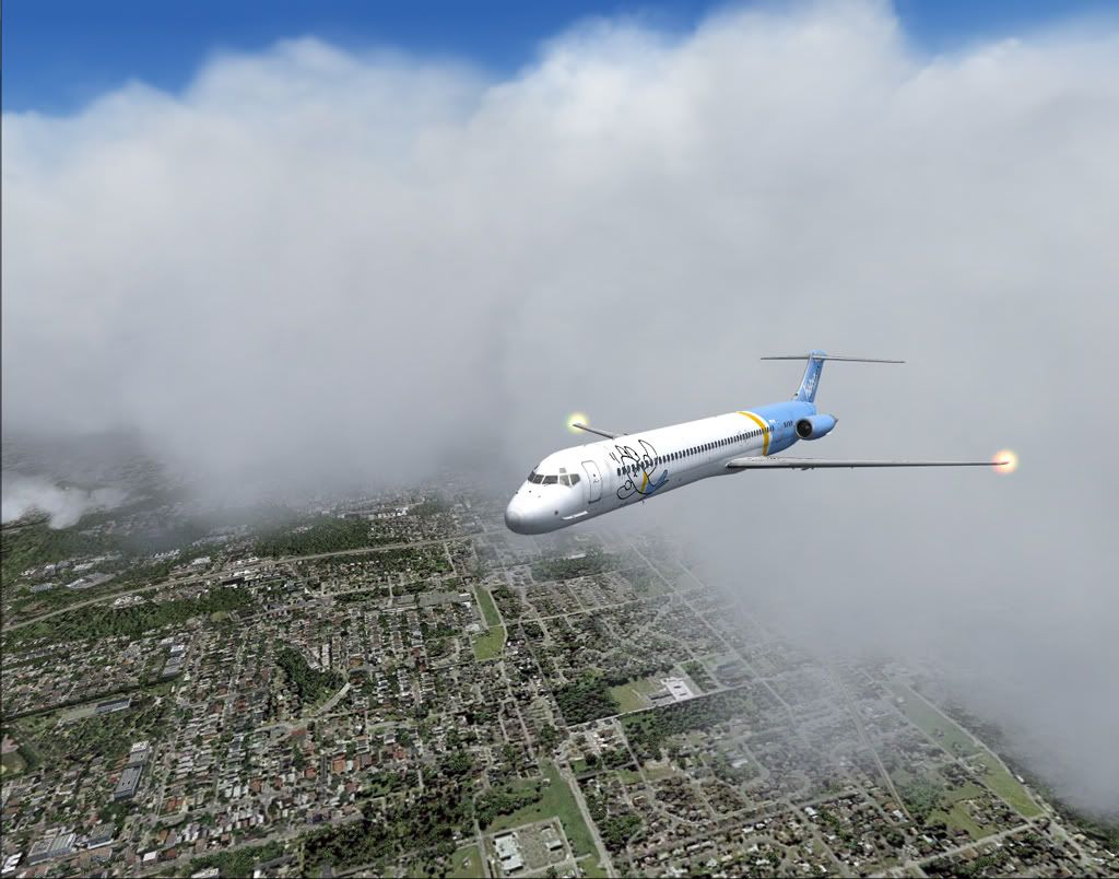
It's the same type of shot:  Plane off center.  That's really what makes both these shot's unique.  The natural instinct when you look at a screenshot is to look in the middle which is why the plane is usually in the center of the shot.  If you move it off to the side or down to the bottom the focus shifts to whatever is in the center.  In a1's shot, the plane is off to the side and the focus is placed onto the setting sun.  THat's the first thing that this shot does, it sets your focus on something beautiful, where as in your shot the focus is confusing.  Should I look at the clouds or the ground?  Definitely not the plane, its too small and too far off to the side to be the main focus.   The next thing a1 has done right is the atmosphere.  The clouds in your shot takes up the whole background and just looks like a wall of fluff.  Finally the ground is a little more exciting and interesting than the flat ground in your shot.

Again, it's not a BAD screenshot, but it can be done MUCH better.

Re: Screenshot Critique: ValuJet

PostPosted: Sat Aug 11, 2007 4:31 am
by Harold
I hate to say 'I told ya' but 'I told ya'.

Although I think that those GEP textures look really nice, the clouds are not defined enough for me. And I know you are using FE so they should be a lot better! Although that livery looks really nice, it doesn't seem to fit the shot well. Amd I'm not even commenting on your beacons ...

Sorry Mees, but I really have seen you do much, much better! Look at this one!!