Screenshot Critique: Randoms part two

Posted:
Wed Mar 07, 2007 5:16 amby DizZa
Re: Screenshot Critique: Randoms part two
Posted:
Wed Mar 07, 2007 7:57 amby Helms
You certainly are improving, but as for offering any tips i'm not sure.
Re: Screenshot Critique: Randoms part two
Posted:
Wed Mar 07, 2007 8:08 amby matt2190
Those are great shots. The only thing I can say is get some different angles. The last three are almost the same angle.
Re: Screenshot Critique: Randoms part two
Posted:
Wed Mar 07, 2007 10:08 amby krigl
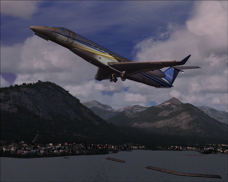
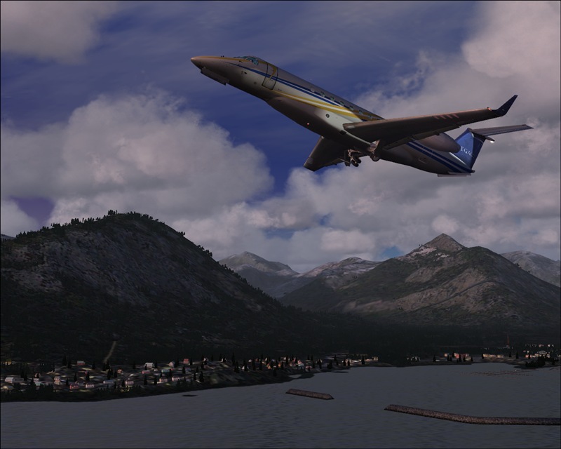
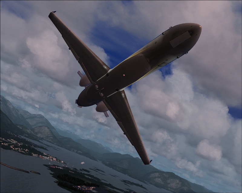
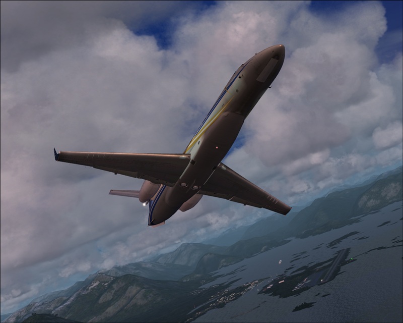
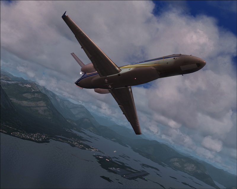
Ok, I think 2 is better than 1, seems to me to get the right balance between detailed plane and lovely scenery. Great pic! Of the second set, I think no 4 is the worst because of the tilt of the horizon. It makes it look as if the plane is climbing at a horribly steep angle. The 5th is probably the best of the 3 because the runway is in there and the angle looks okay. But it seems to me as if the runway should be somehow further to the left, as it seems directly behind the plane, yet the plane's already turned quite a lot. I hope that's helpful!? :)
Re: Screenshot Critique: Randoms part two
Posted:
Wed Mar 07, 2007 4:42 pmby Immelman
I agree that you need different angles, it's more interesting for a viewer if there is a lot of variety.
Re: Screenshot Critique: Randoms part two
Posted:
Thu Mar 08, 2007 6:24 amby krigl
Those are great shots. The only thing I can say is get some different angles. The last three are almost the same angle.
I think that's deliberate - he wanted us to tell him which of the similar shots is better and why.... but he didn't say so, so who knows 8-)