Critique

A workshop designed to help everyone improve their screenshot skills, featuring Simworld, the Screenart Gallery, tutorials, contests and much more!

Critique

Postby Tom... » Sun Jan 13, 2008 12:50 pm

Hey Everyone, recently i have started to use some of the more powerfull features of PS and i have come up with this

Image

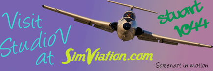
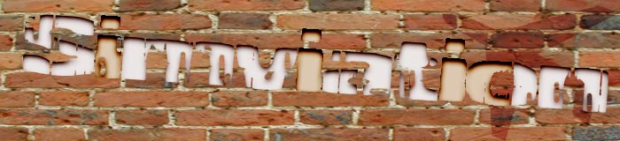
Please tell me what you think and what i should change (or not)

and here is the original

Image

PS i have a high res version if anyone wants it

Tom
Image
User avatar
Tom...
1st Lieutenant
1st Lieutenant
 
Posts: 354
Joined: Tue Jan 16, 2007 5:29 pm
Location: Suffolk

Re: Critique

Postby lilley » Sun Jan 13, 2008 12:57 pm

quite simple really... wow!

I dont quite have the capabilities, or time to learn, in photoshop that brings those results out!

James
lilley
 

Re: Critique

Postby a1 » Sun Jan 13, 2008 1:02 pm

Very nice. I see nothing bad to say about it. ;)
Image
790i : QX9650 : 4Gb DDR3 : GeForce 8800 GTX : 1 WD Raptor : 1 WD VelociRaptor 150
User avatar
a1
Lieutenant Colonel
Lieutenant Colonel
 
Posts: 7608
Joined: Thu Jan 04, 2007 9:16 pm

Re: Critique

Postby stuart1044 » Sun Jan 13, 2008 1:06 pm

Looks spot on, you have nailed the lighting!!

Just wish i had time to create something this great ;)
[center][url=http://www.simviation.com/cgi-bin/yabb2/YaBB.pl?board=studiov]
Image[/url]
Intel Core 2 Duo E6750 @ 2.66ghz, 2gb DDR2 800mhz, Nvidia GeForce 6600GT 256mb, Western Digital
User avatar
stuart1044
Major
Major
 
Posts: 1497
Joined: Tue Mar 14, 2006 5:50 am
Location: Manchester, UK

Re: Critique

Postby J. » Sun Jan 13, 2008 2:06 pm

aircraft and ground looks good :)

however the clouds look weird.
[center]
Striking software Beta Team leader | [url=http://twitter.com/strikingsw]Follow Striking Software on
J.
Major
Major
 
Posts: 1273
Joined: Sat Nov 24, 2007 7:35 pm
Location: Herts/Worcs UK

Re: Critique

Postby spitfire boy » Sun Jan 13, 2008 2:29 pm

agree with kermit about the clouds, and I also feel the raindrops are a bit too prominent.

However all of this is more than made up for by that jaw-dropping lighting! :o
Image


[center]
User avatar
spitfire boy
Major
Major
 
Posts: 2587
Joined: Mon May 21, 2007 4:46 pm
Location: Wherever you think I'm not

Re: Critique

Postby Tom... » Sun Jan 13, 2008 2:53 pm

Had a bit of a tinker with the levels to try and fix the clouds

Image
Image
User avatar
Tom...
1st Lieutenant
1st Lieutenant
 
Posts: 354
Joined: Tue Jan 16, 2007 5:29 pm
Location: Suffolk

Re: Critique

Postby cpthammond » Sun Jan 13, 2008 3:23 pm

Cool apart from the underside of the aircraft is a little over saturated with those white lights.
cpthammond
Ground hog
Ground hog
 
Posts: 9
Joined: Tue May 13, 2008 6:26 pm
Location: EGYD

Re: Critique

Postby spitfire boy » Sun Jan 13, 2008 4:48 pm

Looks good Tom - I personally think the lighting on the plane being saturated adds a wonderful drama... :D
Image


[center]
User avatar
spitfire boy
Major
Major
 
Posts: 2587
Joined: Mon May 21, 2007 4:46 pm
Location: Wherever you think I'm not

Re: Critique

Postby Clipper » Sun Jan 13, 2008 4:53 pm

I prefer the pre adjusted version. The rainbow coloring in the clouds is impressive and seems to get lost in the updated version.. Now if you can add a touch more scenery you're really kicking butt..really dramatic work Tom.
Last edited by Clipper on Sun Jan 13, 2008 4:54 pm, edited 1 time in total.
Image
User avatar
Clipper
Global Moderator
Global Moderator
 
Posts: 8420
Joined: Tue Aug 23, 2005 5:40 am


Return to Studio V Screenshot Workshop

Who is online

Users browsing this forum: No registered users and 291 guests