OK, you asked for it.

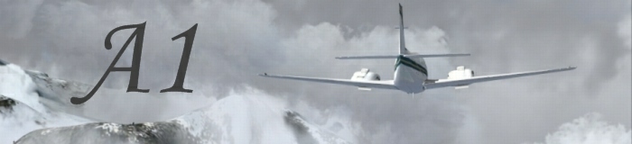
This shot really is nothing special. It's generic, and actually looks cliche. That particular angle has been used quite a bit, and the plane is a little too far away, and for a military aircraft, there is nothing exciting going on in this photo.
Your too high, descend.
There are clouds in the background, but none in the foreground. This makes the shot look rather 2 dimensional, and takes away from the excitement in the photo.
Quality control is good, no problems with jaggies or compression.
You are too far away from the scenery, in fact, there is hardly any at all. Good mountains make good shots and add a third dimension to the picture, and you can never run out of good mountains. Flat plains are never looked that great.
That's all I can find.
Hope this helps. Remember:
Fly in the scenery, not above it.
Fly inside the clouds, or close to them.
Find an angle that shows off both the plane and the scenery.
Have the plane doing something exciting.
These are the keys to making any shot look good. I look foward to seeing your future endeavours.