Screenshot Critique: Randoms

A workshop designed to help everyone improve their screenshot skills, featuring Simworld, the Screenart Gallery, tutorials, contests and much more!

Screenshot Critique: Randoms

Postby DizZa » Sun Mar 04, 2007 4:26 am

YAY, compression!
Image

Near Sitka:
Image
Flying out of Sitka:
Image

Opinions....?
DizZa
 

Re:  Screenshot Critique: Randoms

Postby flymo » Sun Mar 04, 2007 4:29 am

awesome shots boyo.

that last one is so crisp its brilliant 8) :D

john
flymo
 

Re:  Screenshot Critique: Randoms

Postby Jakemaster » Sun Mar 04, 2007 10:12 am

Nice shots, but you are relying too much on scenery.  Lemme explain...its like the post a while back about photoreal tails.  Yes, they are nice, but they don't call for WOW amazing comments.  In your first shot, its a nice shot, but not amazing, its just really good scenery and clouds.  The second is nice with the clouds and the time and you clearly picked the right spot, this one isn't as much of a 'photo tail' kind of shot.  The last one is good though, very original
Jakemaster
 

Re:  Screenshot Critique: Randoms

Postby ATI_7500 » Sun Mar 04, 2007 10:29 am

The foreground in the first is excellent, but the autogen starts lacking detail (and buildings) in the background.
Since number two is shot against the sun, it's way too bright for my taste. Yet the landscape looks quite beautiful.
No objections on number three. Crisp, nice angle, showing some action.
ATI_7500
 

Re:  Screenshot Critique: Randoms

Postby krigl » Sun Mar 04, 2007 4:01 pm

I think all kinds of shots that people want to share are welcome, and whether one shot 'deserves' praise more than another is irrelevant. Just my opinion....

The first would be great as part of a set about a light GA flight. Or a 'look at my great autogen'  type post. I find it natural that it isn't crisp in the background - it's very far away, and some people even edit their background by blurring in an attempt  to get an illusion of depth... I've been trying it too...I also darken the foreground and lighten the background trying to get the same effect. So there's nothing  wrong with the first.

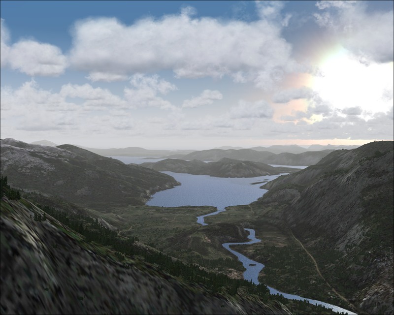
The second is a pretty scenery  shot, nothing more, but very easy on the eye... unless making something for a competition I usually think of things in terms of sets, and presented as a stand-alone the second isn't that special. But as part of a flight or a 'scenery of the X region' thread it would be great. Just like a photoreal tail as part of a set about a tube taking off from somewhere or other would also be nice.

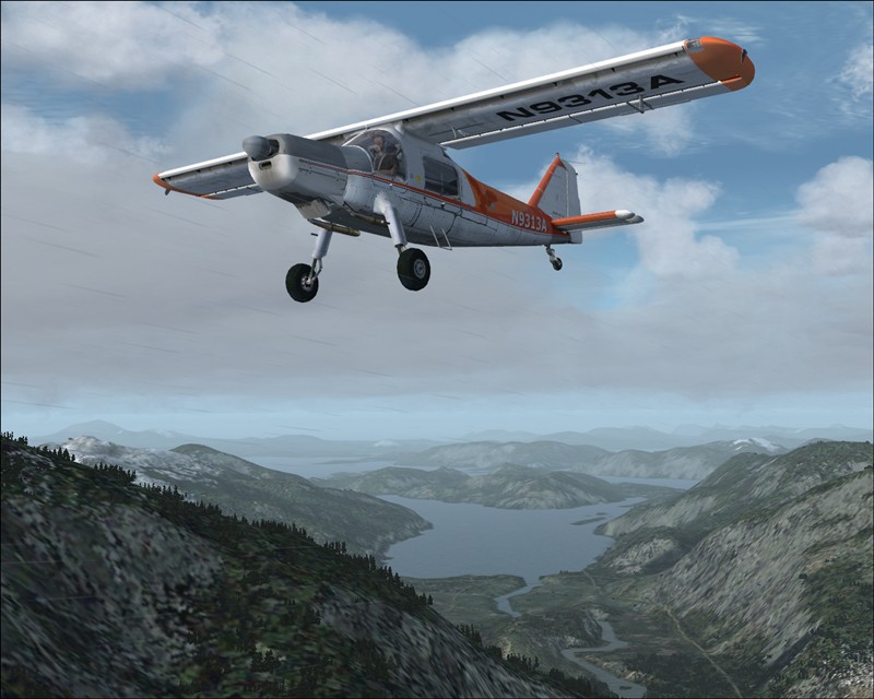
The third for me is very ordinary,  the plane should be to the right I'd say, and covering part of the background perhaps to make it more 'part of' the scene. The absence of clouds seems a bit boring too in this context...

I don't like one shot posts, unless they are either humorous, or of exceptional 'stand-alone' quality. One-shot sunset posts are my pet hate  ;D Particularly if that person has  already posted three other one shot posts within an hour of each other.  There is a name for this, four letters, beginnning with S...  ;)

Cheers

Krigl
If you're bored of an evening - and you'll have to be - you can check out my screenshot gallery: Kriglsflightsimscreens...HERE

[center][img]http://www.simviation.com/phpup
krigl
Lieutenant Colonel
Lieutenant Colonel
 
Posts: 8234
Joined: Fri Jun 10, 2005 3:47 am

Re:

Postby Souichiro » Sun Mar 04, 2007 4:44 pm

1st and 3rd I don't really like no 2 is brilliant

in no 2 it looks to me that you have created both depth in the distance but also in height... something I find hard to do!

I'm not a great fan of crowded area's as they quickly look cluttered to me.

No 3.. The plane and angle aren't really to my tasted and the plane from nose to start of wings section looks to long to me.. That's just a question of personal taste though..

As for the 1 shot posts I agree With Krigl here!
Last edited by Souichiro on Sun Mar 04, 2007 4:44 pm, edited 1 time in total.
Image
User avatar
Souichiro
Ground hog
Ground hog
 
Posts: 0
Joined: Tue Aug 28, 2007 11:34 am

Re:

Postby DizZa » Sun Mar 04, 2007 11:47 pm

One shot posts? Huh? What? I don't get it? There is three shots.

*Throws tantrum*
Last edited by DizZa on Mon Mar 05, 2007 12:27 am, edited 1 time in total.
DizZa
 

Re:

Postby krigl » Mon Mar 05, 2007 4:13 am

[quote]One shot posts? Huh? What? I don't get it? There is three shots.

*Throws tantrum*
If you're bored of an evening - and you'll have to be - you can check out my screenshot gallery: Kriglsflightsimscreens...HERE

[center][img]http://www.simviation.com/phpup
krigl
Lieutenant Colonel
Lieutenant Colonel
 
Posts: 8234
Joined: Fri Jun 10, 2005 3:47 am

Re:  Screenshot Critique: Randoms

Postby DizZa » Tue Mar 06, 2007 3:03 am

Ok. Heres two shots taking in some suggestions:
Image
Image
Opinions...?
DizZa
 

Re:  Screenshot Critique: Randoms

Postby cspyro21 » Tue Mar 06, 2007 3:14 am

As a shot, the first one is good - you've not just relied on scenery and shown more of an aircraft here. But #2 is by far the better of the two. The colours oare fantastic - by playing around with time / lighting etc you can create drama in your shots. In the first image I get the feeling of "flying on a rainy day". On the second one I ge tht efeeling of "Got to get back before this weather gets worse".Good joob Arnaage with that last pic, a fine pic indeed! 8-)
User avatar
cspyro21
Major
Major
 
Posts: 4987
Joined: Sun Aug 28, 2005 6:11 am

Re:  Screenshot Critique: Randoms

Postby krigl » Tue Mar 06, 2007 4:05 am

I have to disagree completely with Spyro  ;D

The first shot has much more detail visible and looks pretty believable, and pretty nice too...

The second shot is 'yet another' sunset shot with nice colours but less detail. Also, if you look at the water body you can see a blocky 'texture change' artefact...

If you want your shots to be popular sunsets are definitely the way to go, but trying to make a great screenshot without relying on sunset colours is more challenging, just my opinion... :)
If you're bored of an evening - and you'll have to be - you can check out my screenshot gallery: Kriglsflightsimscreens...HERE

[center][img]http://www.simviation.com/phpup
krigl
Lieutenant Colonel
Lieutenant Colonel
 
Posts: 8234
Joined: Fri Jun 10, 2005 3:47 am

Re:

Postby DizZa » Tue Mar 06, 2007 4:18 am

[quote]I have to disagree completely with Spyro
DizZa
 

Re:  Screenshot Critique: Randoms

Postby DizZa » Wed Mar 07, 2007 5:16 am

DizZa
 

Re:  Screenshot Critique: Randoms

Postby krigl » Wed Mar 07, 2007 10:03 am

Yes, the second set of pictures are 'better' than the first, that's for sure... 'scenery' shots usually do look better with a plane in them, because that's what you expect to see, and it isn't a real photo, of course, so they usually look a bit 'gamey'. But there's nothing wrong with a scenery or out of the window shot once in a while as part of a set. Not every shot has to be the best and totally pwn everyone else's, right? At least,that's how I operate  :)
If you're bored of an evening - and you'll have to be - you can check out my screenshot gallery: Kriglsflightsimscreens...HERE

[center][img]http://www.simviation.com/phpup
krigl
Lieutenant Colonel
Lieutenant Colonel
 
Posts: 8234
Joined: Fri Jun 10, 2005 3:47 am


Return to Studio V Screenshot Workshop

Who is online

Users browsing this forum: No registered users and 242 guests