Page 1 of 1

Bye-Bye, Butch...

PostPosted: Tue Sep 01, 2015 12:12 pm
by GlobalHobo
Departing KORD in POSky's 737-800.

Image

Image

Image

Image

I miss American's old livery. Is it just me, or is their new logo reminiscent of Greyhound? Apropos, perhaps...

Re: Bye-Bye, Butch...

PostPosted: Tue Sep 01, 2015 8:48 pm
by OldAirmail
Before I get started, let me say - Great pictures. :D


Whoever "we" are, from different continents, and different countries, I think that "we" like the airlines of our youth.

I remember looking up into the New York sky's (before even JFK was built) and picking out the airlines & airplane types. Somewhere around 2,000 to 2,500 feet above our house.

So naturally, I still like the "old" airplanes. And, naturally, the old colors.


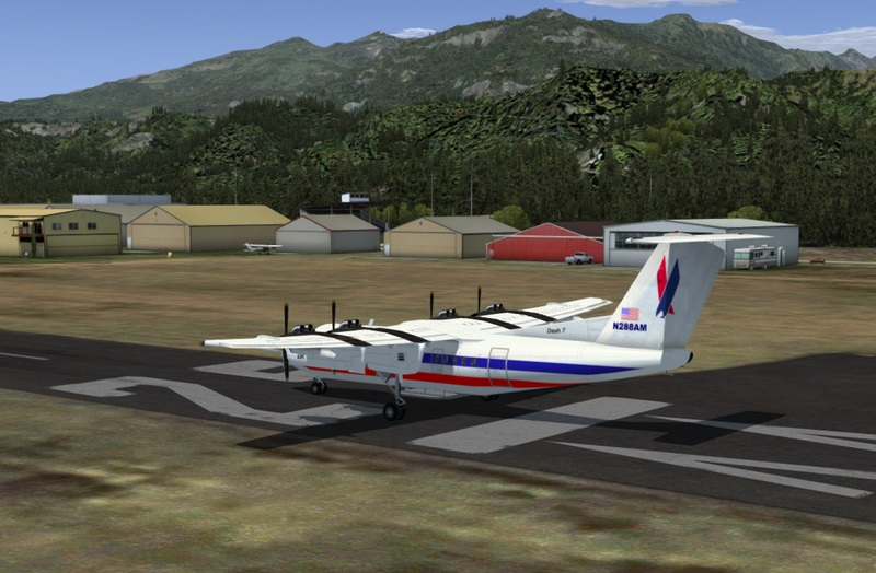
Luckily for me, Caltabiano Nunzio, did a paint job (aircraft included) for the DeHavilland Dash 7.

And this plane, along with my Orbx city of Concrete Airport, is my "home base".

For authenticity, not all that correct. Although Piedmont Airlines did have Dash 7s, and Piedmont was part of the American Eagle system (which was/is US Airways Express, a branch of American Airlines), so this color scheme could have, almost, been real.

Whatever. Thank you Caltabiano Nunzio.

Image


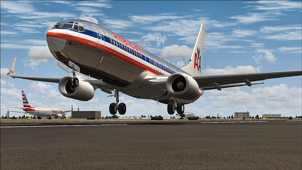
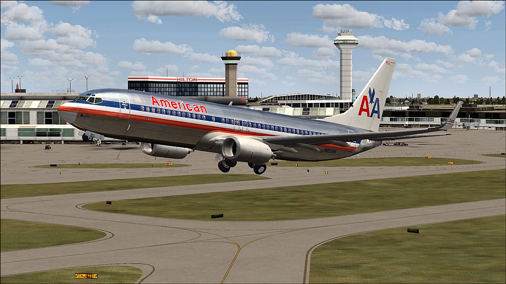
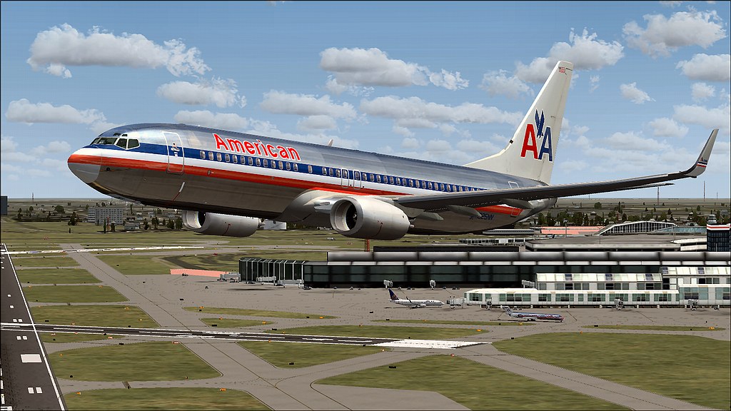
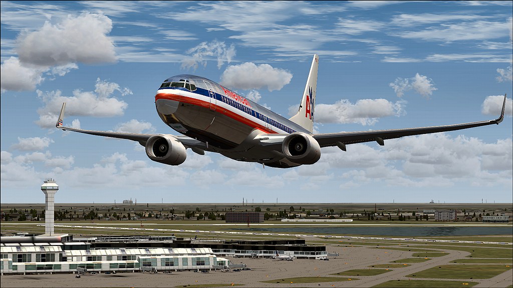
As to the new AA color scheme, :confusion-shrug: .

People & companies often change things just to prove that they are still alive. Vibrant is the useless and overused word for it, I suppose.

So this change fits in with all the other "vibrant" airlines.

Image

Image

Image


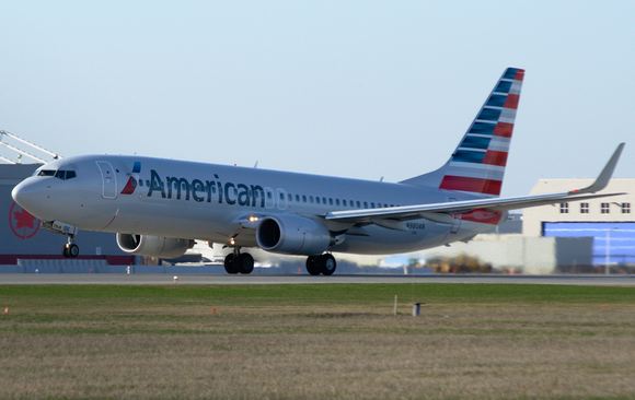
Many years from now, a little kid will look up into the sky and say - "I don't like the new paint scheme". :lol:

Re: Bye-Bye, Butch...

PostPosted: Wed Sep 02, 2015 1:19 am
by Hawkeye07
Talking about "vibrant" airlines when I first began working for Northwest Airlines in 1992 the aircraft had a simple blue and white stripe down the length of the fuselage and a red tail with a white logo. The logo was a representation of a "W" and a compass needle pointing to the northwest. It was the same on both sides of the aircraft.
Image

Simple and easy to apply and maintain. Then they went to the "Bowling Shoe" paint scheme but the tail logo stayed the same.
Image

A few years later the "Brains At The Top" decided to change the scheme again but this time more "Vibrant" and in step with the times. We called it the "Beer Can" scheme.
Image

The logo was simplified and made larger. A second logo was painted on the forward fuselage also. The only problem was when they designed the paint scheme for the right side of the aircraft the logo got switched around so it faced NORTHEAST!
Image

When many of the employees made mention of this oversight we were given the excuse that they (the "Brains At The Top") wanted people to think of Northwest as a "forward looking " airline. No one believed that one for a second. They screwed up and didn't want to admit it. True story I'm sorry to say.

Re: Bye-Bye, Butch...

PostPosted: Thu Sep 03, 2015 2:01 am
by GlobalHobo
Airmail, I love your perspective on things! Hawkeye, I remember when NWA adopted the "Beer Can" scheme. The company I flew for at the time used Northwest's training facilities in Eagan. We scratched our heads, but as NWA guests, we kept our thoughts to ourselves. Thank you both for reviving some great memories.

Re: Bye-Bye, Butch...

PostPosted: Fri Sep 04, 2015 1:34 am
by Hawkeye07
GlobalHobo wrote:Airmail, I love your perspective on things! Hawkeye, I remember when NWA adopted the "Beer Can" scheme. The company I flew for at the time used Northwest's training facilities in Eagan. We scratched our heads, but as NWA guests, we kept our thoughts to ourselves. Thank you both for reviving some great memories.


You're welcome! :D