by jankees » Mon Feb 01, 2010 4:40 am
don't say I didn't warn you..
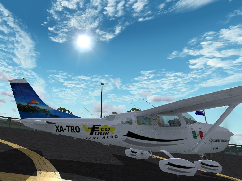
I'll second the motion about the roundel on the second one, that needs to be more outboard.
As for the 1st, it looks great, but there are a few details:
- the text on the nose should be in italics I believe
- the flag is too big
- the bottom stripe/swoosh is too fat, both on the fuselage and on the wheel covers. It is thinner than the top one.
- The swooshes should both be on the top part of the wheel covers, and be thinner.
- I think there is only one (dark) swoosh on the front wheel?
- the tail textures go a bit too high on the stabiliser
- the 'taxi aereo' should be parallel to the text above, and it goes too low on the fuselage (but this may be due to distortions? I don't know these textures)
- the 'Eco tour' seems a bit blurry in this shot?
Aaaaargh, I can hear you think...well, you asked for opinions, sorry about this. It's always the stupid little details.
But seriously, great paint for your third attempt, you should see my third one..eeh, no, you should not..
Last edited by
jankees on Mon Feb 01, 2010 4:57 am, edited 1 time in total.