Page 1 of 1

Rip This

PostPosted: Sat Oct 13, 2007 4:51 pm
by Stubbedtoe18
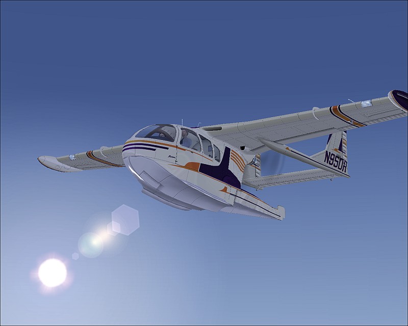
A single picture here.  Have at it.  Mildly saturated, so the less vivid color scheme was intentional.

Image

Re: Rip This

PostPosted: Sat Oct 13, 2007 4:55 pm
by gottoflynow
It has good potential and is nice and crisp, but its too boring. There is no clouds, or even any ground to look at, and i personally dont like the lens glare at all on any picture.If there were to just be some other stuff in it to look at this pic would be great!

Keep trying and you'll get it ;)

-GTFN

Re: Rip This

PostPosted: Sat Oct 13, 2007 4:56 pm
by Stubbedtoe18
Kinda meant to be like that  ;D

Re: Rip This

PostPosted: Sat Oct 13, 2007 5:05 pm
by gottoflynow
Kinda meant to be like that  ;D


Ohhh... you should of said so :D

Re: Rip This

PostPosted: Sat Oct 13, 2007 5:06 pm
by Stubbedtoe18
;D ;)

I'm surprised it's so crisp because that's without AA on  :D

Re: Rip This

PostPosted: Sat Oct 13, 2007 5:24 pm
by aussiewannabe
Not a big fan of the lens glare, but I like the AC 8-)

Here's a tip (and I should abide by this too, cough, cough, hint, hint!): Never put your subject in the center. What you want is for the viewer to move their eyes around the entire screenshot. You have all that space. Use it wisely and the viewer will appreciate your effort more.

Here's an example: http://www.simviation.com/yabbuploads/LAXNight2.jpg

Re: Rip This

PostPosted: Sat Oct 13, 2007 5:38 pm
by spitfire boy
First of all, don't clip the wings off...EVER... :P

;D

Overall it's nice - the AC is very interesting - but I think that it is rather dull. If you wanted that slightly washed-out feel I can understand why but I think you could still have added a bit of interest with some clouds while still keeping the colours washed-out.