What do you guys think? Anything I should have done differently?
Flight Simulator and other chat
![]() by BAW0343 » Tue Nov 18, 2008 7:39 pm
by BAW0343 » Tue Nov 18, 2008 7:39 pm


![]() by flyboy 28 » Tue Nov 18, 2008 8:01 pm
by flyboy 28 » Tue Nov 18, 2008 8:01 pm
![]() by Wii » Tue Nov 18, 2008 8:52 pm
by Wii » Tue Nov 18, 2008 8:52 pm
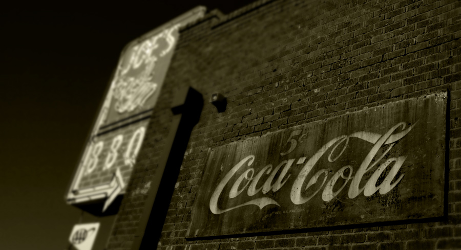
Very moody. I dig the sepia.
Too bad about the AAA sign. It takes away from the 50's feel. Nice cap!
![]() by BAW0343 » Tue Nov 18, 2008 9:29 pm
by BAW0343 » Tue Nov 18, 2008 9:29 pm
Very moody. I dig the sepia.
Too bad about the AAA sign. It takes away from the 50's feel. Nice cap!
AAA sign would be easy to remove, 2 minutes or less. 8-) Very cool, do you have a full res version?

![]() by Rifleman » Wed Nov 19, 2008 1:26 am
by Rifleman » Wed Nov 19, 2008 1:26 am

![]() by a1 » Wed Nov 19, 2008 1:47 am
by a1 » Wed Nov 19, 2008 1:47 am

![]() by tcco94 » Wed Nov 19, 2008 1:53 am
by tcco94 » Wed Nov 19, 2008 1:53 am

![]() by BAW0343 » Wed Nov 19, 2008 11:48 am
by BAW0343 » Wed Nov 19, 2008 11:48 am
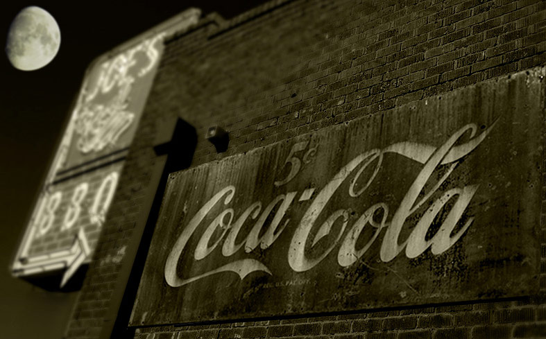
That is awesome but you know what I think would be really cool...
This is only if that Coca-Cola sign has any red on it show the logo with its normal colors then the rest sephia or whatever it is and keep the blur.
Great talent and great shot. Looks pro 8-)

![]() by eno » Thu Nov 20, 2008 3:02 am
by eno » Thu Nov 20, 2008 3:02 am
That is awesome but you know what I think would be really cool...
This is only if that Coca-Cola sign has any red on it show the logo with its normal colors then the rest sephia or whatever it is and keep the blur.
Great talent and great shot. Looks pro 8-)
![]() by tcco94 » Sat Nov 22, 2008 2:18 am
by tcco94 » Sat Nov 22, 2008 2:18 am
That is awesome but you know what I think would be really cool...
This is only if that Coca-Cola sign has any red on it show the logo with its normal colors then the rest sephia or whatever it is and keep the blur.
Great talent and great shot. Looks pro 8-)
![]() by BAW0343 » Sat Nov 22, 2008 12:20 pm
by BAW0343 » Sat Nov 22, 2008 12:20 pm
Users browsing this forum: No registered users and 263 guests