Surfer
I was in San Diego last year and was able to get some surfer shots from on top of a pier. Well Ive had trouble sleeping tonight and experimented with some black and white options in photoshop. This was supposed to give it a high contrast blue filter look.
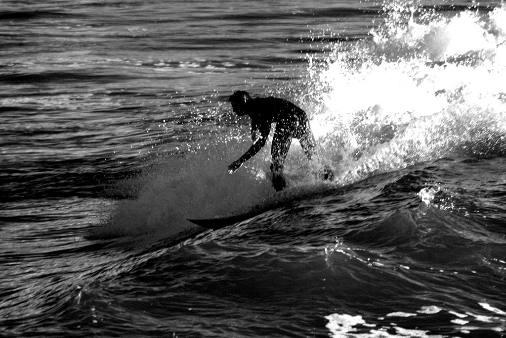
Just wondering what you guys think in comparison of the original pic below.
1024 is a little larger then I like to post usually but oh well.
I'm a fan of B&W photography for the reason it usually brings out the contrast better then a color photo does. However, I usually shoot in color then change it later since you can't add color if you want it at a later time. Though, I don't always know if the change improves the photo when I do change it.
What do you guys think about this application? It may work better in color but I kind of like the B&W.
Please feel free to comment
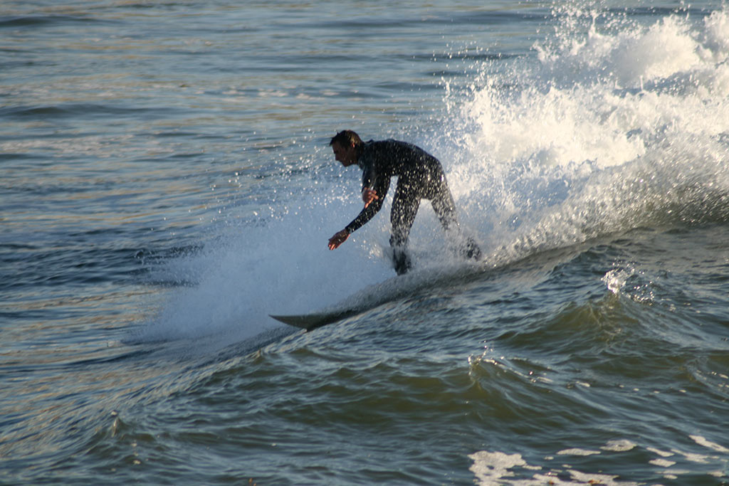
