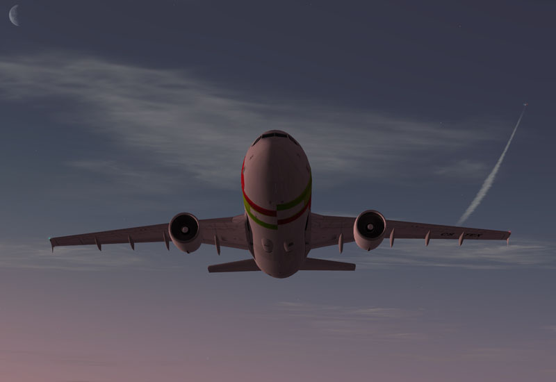
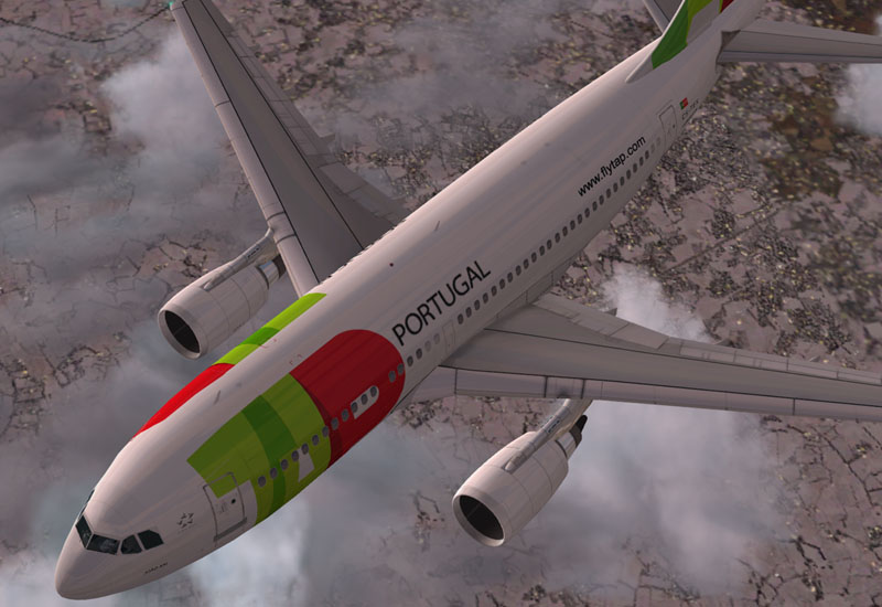
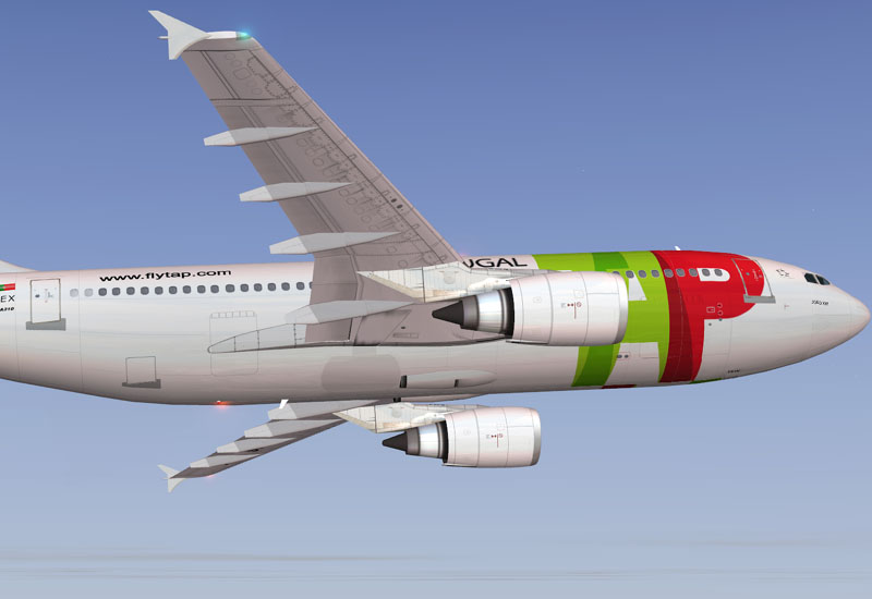
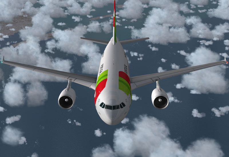

Flight Simulator and other chat
![]() by Nexus » Fri Dec 30, 2005 5:33 pm
by Nexus » Fri Dec 30, 2005 5:33 pm
![]() by Ecko » Fri Dec 30, 2005 6:52 pm
by Ecko » Fri Dec 30, 2005 6:52 pm


![]() by CODY614 » Fri Dec 30, 2005 7:11 pm
by CODY614 » Fri Dec 30, 2005 7:11 pm
![]() by Alphajet_Enthusiast » Sat Dec 31, 2005 1:19 am
by Alphajet_Enthusiast » Sat Dec 31, 2005 1:19 am


![]() by Ecko » Sat Dec 31, 2005 7:28 am
by Ecko » Sat Dec 31, 2005 7:28 am
![]() by Nexus » Sat Dec 31, 2005 7:42 am
by Nexus » Sat Dec 31, 2005 7:42 am
A little off topic, but does the A310 and A300, in real life, use Fly-By-Wire?
![]() by krigl » Sat Dec 31, 2005 4:07 pm
by krigl » Sat Dec 31, 2005 4:07 pm
![]() by Fitter » Sun Jan 01, 2006 7:16 am
by Fitter » Sun Jan 01, 2006 7:16 am
Return to Payware Screenshot Showcase
Users browsing this forum: No registered users and 654 guests