by Kleen Harry » Thu Aug 02, 2007 2:49 pm
Very nice, Chris! This is a HUGE improvement over the last one primarily because you used a nice, high quality background this time around. It just makes an enormous difference in the overall image! Way to go! :)
Jaggies are easy to fix. That isn't going to be any challenge for you. It's amazing how many things you are doing RIGHT, especially with only 3 or 4 edits under your belt! :o
To address what I subjectively see as the single biggest issue with this image please permit to make a few suggestions regarding composition:
1) As a GENERAL rule it usually doesn't work out well to have parts of the aircraft very near or touching the border of the image. Why? Well, it feels unnatural to the viewer and makes the image feel "cramped". It ruins the illusion of the plane being in the wide open spaces.
2) When assessing your own images it may be helpful to look at what's NOT there as well as what is there. What do I mean? Images can be viewed as essentially being composed of space and objects. However, the space is actually an object as well! Assess the shape of the "space"! If the shape of the space surrounding the objects and subjects looks good too, then you probably have a well-composed, well-balanced image.
For example, imagine the planes as being solid black with no detail. Now pay attention to the shape of the background. What do you see? Do you see the very narrow strip along the right side near the tail of the A-10? Doesn't that make the shape of the background look "out of balance"? ;)
So, my subjective suggestion is to develop an awareness of the "space" as well as of the "things".
Keep up the good work! Slow and steady wins the race! :)
Tallyho,
Don
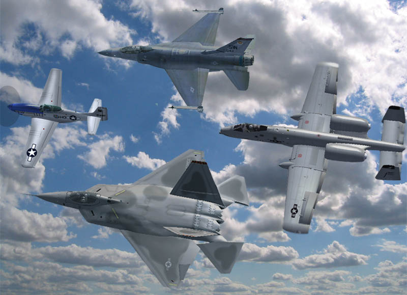
 It's actually a YF-22. The Alphasim F-22 is the one to go for if you want a decent Raptor.