Bush flying

Posted:
Tue Jul 17, 2007 11:01 amby Mictheslik
Admiring the scenery....
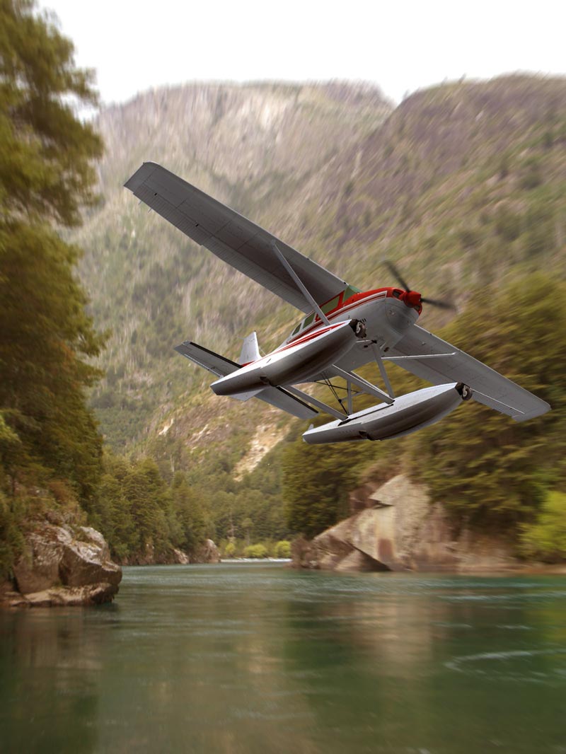
^^Click for very big pic

Had a really creaive day today.....3 edits!!!!
.mic
Re: Bush flying
Posted:
Tue Jul 17, 2007 11:07 amby voodoo1
Spectacular looking shot mate.. I must say your shots have improved massively!
Re: Bush flying
Posted:
Tue Jul 17, 2007 12:34 pmby Kleen Harry
Very nice, Mic! Just beautiful! :)
A few thoughts for your consideration, mostly as regards blending:
1) Contrast: Look at how muted the background is in terms of contrast. You want the plane to stand out BUT you might find that it blends better if it were a little more muted, less punched up. You don't want the plane to blend SO much that it becomes "invisible" against the background BUT I think that the goal is to end up with a "seamlessness" to the image. The subject needs to clearly be the subject but it should "flow" with the rest of the image.
2) Hue and Color Balance: Look at the colors of the light in the image. It's muted, pastel and off-white. Very small and careful adjustments to the hue and color on the plane can leave it still clearly standing out but not quite so much standing off. IMHO, this can make a big difference BUT one has to be very careful to not overdo it!
3) Reflection: Shadows are affected by the angle of the light but reflections are not. I find that I'm continually looking for a reflection of the plane in the water with this one. It's tricky to make it look right and not artificial or overdone. I think that if you could pull it off in this one it would enhance an already great image immensely. That's not one of my strong suits but there are plenty of guys around who do that quite well and who I'm sure would be more than happy to offer tips and hints.
Very nicely done, Mic! Keep on keeping on, M8! :)
Re: Bush flying
Posted:
Tue Jul 17, 2007 12:44 pmby Mictheslik
Very nice, Mic! Just beautiful! :)
A few thoughts for your consideration, mostly as regards blending:
1) Contrast: Look at how muted the background is in terms of contrast. You want the plane to stand out BUT you might find that it blends better if it were a little more muted, less punched up. You don't want the plane to blend SO much that it becomes "invisible" against the background BUT I think that the goal is to end up with a "seamlessness" to the image. The subject needs to clearly be the subject but it should "flow" with the rest of the image.
2) Hue and Color Balance: Look at the colors of the light in the image. It's muted, pastel and off-white. Very small and careful adjustments to the hue and color on the plane can leave it still clearly standing out but not quite so much standing off. IMHO, this can make a big difference BUT one has to be very careful to not overdo it!
3) Reflection: Shadows are affected by the angle of the light but reflections are not. I find that I'm continually looking for a reflection of the plane in the water with this one. It's tricky to make it look right and not artificial or overdone. I think that if you could pull it off in this one it would enhance an already great image immensely. That's not one of my strong suits but there are plenty of guys around who do that quite well and who I'm sure would be more than happy to offer tips and hints.
Very nicely done, Mic! Keep on keeping on, M8! :)
some useful advise...cheers mate..I went back and redid a bit....the reflection could probably use a bit of work
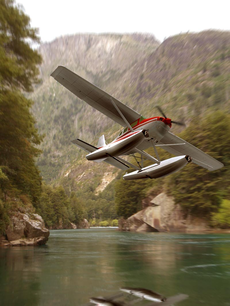
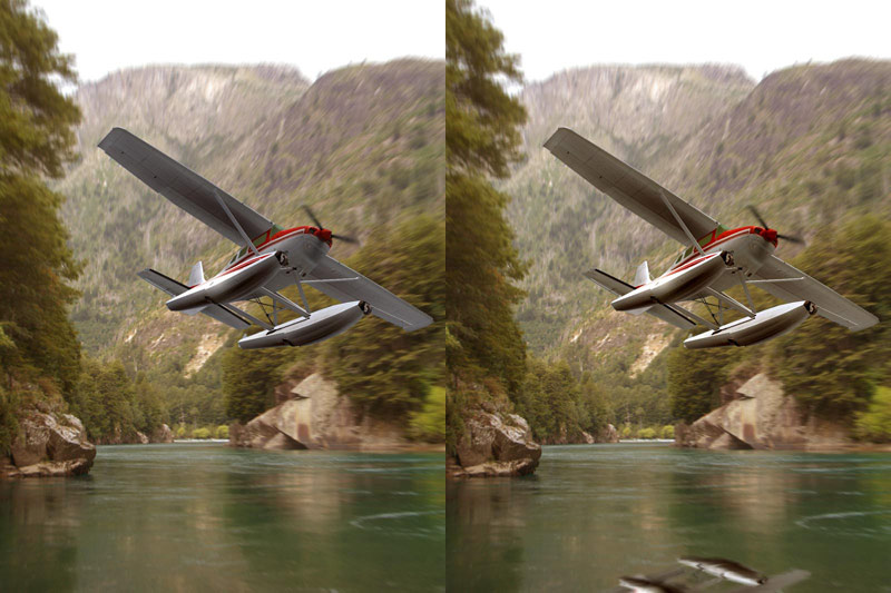
and heres a comparison....I like the new way the plane blends in better...I forgot to change contrast...I nrmally do...slipped my mind this time...
.mic
Re: Bush flying
Posted:
Tue Jul 17, 2007 2:14 pmby Kleen Harry
Well, it appears as if the contrast on the plane has actually increased. For example, look at the inner aspect of the pontoon where some of the grays have dropped out. I was thinking of the opposite direction. :)
You could also use variations to knock down the highlights a bit instead.
The reflection looks good but I imagine it more directly under the plane and about the same size as the plane because the plane is so low above the water.
At any rate, those are just my subjective opinions. I ain't gonna nit pick, hee, hee! You have the idea and hopefully that may prove of some value or use to you. I think if you find a useful concept that you'll interpret in your own way more and more precisely over time. The only really important thing is that YOU like it! ;)
As I said before, it's an impressive image no matter how you slice it. The choice of background, compositon, choice of plane, etc., is just great. Great vision there, Mic! :)