Page 1 of 1

A First....

PostPosted: Sun Mar 04, 2007 7:03 pm
by cloud9
This is my first composite. Not the greatest but tell me what to do ;)

Image

Re: A First....

PostPosted: Sun Mar 04, 2007 7:06 pm
by ThatOnePerson
Well, ummm, hmmmm. This may just be me but the black paint doesn't fit well, also maybe use a more "photoreal" paint. Also, its blended ok but could be better :) Other than that, I like it ;)

Re: A First....

PostPosted: Sun Mar 04, 2007 7:12 pm
by cloud9
Ok, I'll try that in the next one. How can I improve the blending? ;)

Re: A First....

PostPosted: Sun Mar 04, 2007 9:24 pm
by FSGT Gabe
Not the most realistic, but it looks really cool.  I would agree, though, that since in composites usually you're aiming for realism you should try a more photoreal paint...

- Kevin :D

Re: A First....

PostPosted: Mon Mar 05, 2007 4:23 am
by krigl
The main thing for me is the composition... the plane is wierdly positioned, and the edges look a little jaggy... but not bad!!  :)

Re: A First....

PostPosted: Mon Mar 05, 2007 6:33 am
by Sytse
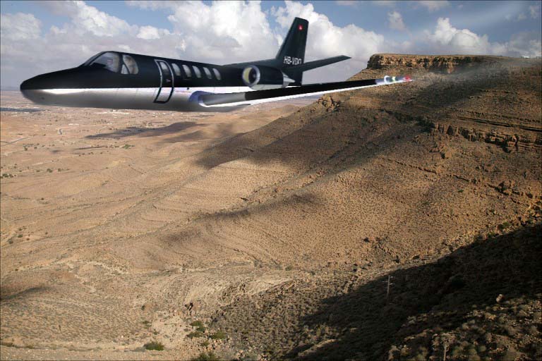
I agree with Krigl. The main thing that should be improved is the composition. The plane is pushed away into the corner and it's right on the horizon. To make the shot more interesting, position the plane more towards the center of the pic, but not right in the middle! Also, use a little bank of the plane, in stead of showing it in straight level flight. I don't think the paint is a big problem here. It just needs some highlights. For tips on blending, see my blending tutorial in the library. The jaggies don't look too bad and this will improve as you make more composites. If you have photoshop, make sure you use the pen tool to cut out the plane. Overall, this one is pretty good for a first, so keep it up! ;)