1 Tail shot!

Let loose your artistic flair! No Rules except please keep shots within 380K & 2000 pixels wide.

1 Tail shot!

Postby eee722 » Fri Dec 15, 2006 6:25 pm

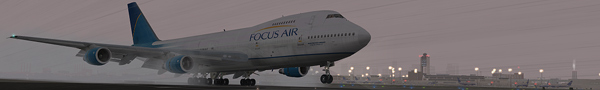
hey everyone, heres my edited shot:

Maybe we are not making the sign up page clear enough ....... NO LINKED IMAGES...ALL IMAGES MUST BE UPLOADED TO SIMVIATION!!!
Last edited by eno on Sat Dec 16, 2006 5:10 am, edited 1 time in total.
www.flypalm.com
join us today
User avatar
eee722
Ground hog
Ground hog
 
Posts: 3
Joined: Fri Dec 15, 2006 7:20 pm

Re: 1 Tail shot!

Postby Mees » Wed Dec 20, 2006 8:17 am
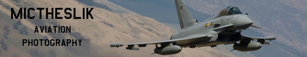
::)


I mostly like the way those red letters are in contrast with the grey background of the forums...
Image
AMD Athlon 4200+ :: Gigabyte K8n-SLi :: 1GB RAM :: 7900GTX 512MB
User avatar
Mees
Major
Major
 
Posts: 3659
Joined: Fri Aug 05, 2005 10:08 am
Location: Netherlands, the

Re: 1 Tail shot!

Postby Mictheslik » Wed Dec 20, 2006 8:23 am

Well done mods....that was quick :)

Also Mees I like the way you've chosen Boba Fett as you avatar :)

.Mic
Last edited by Mictheslik on Wed Dec 20, 2006 8:23 am, edited 1 time in total.
[center]Image
User avatar
Mictheslik
Lieutenant Colonel
Lieutenant Colonel
 
Posts: 5517
Joined: Wed Mar 30, 2005 11:32 am
Location: Bristol, England

Re: 1 Tail shot!

Postby Splinter562 » Wed Dec 20, 2006 2:18 pm

I think I'd call it more of a bluish-grey or hazel background. Perhaps a larger font size or bold would help to accentuate the prominent features of the message. But I agree with Mees, the red letters a quite striking. I'm looking forward to seeing more of these fantastic edits in the future.
Last edited by Splinter562 on Wed Dec 20, 2006 2:19 pm, edited 1 time in total.
User avatar
Splinter562
2nd Lieutenant
2nd Lieutenant
 
Posts: 219
Joined: Mon Nov 20, 2006 1:56 am
Location: Tampa, FL

Re: 1 Tail shot!

Postby Lazerbeak » Wed Dec 20, 2006 2:48 pm

Hmmm, it is a very nice edit, but I feel that the #DDE3EB-coloured backdrop doesn't have the same zing that #DDF9EB does. Also, a more exciting font like Impact, Arial Rounded, or even Comic Sans would not go unwelcomed.

Still, that's just me nitpicking, it's a fine edit.
Last edited by Lazerbeak on Wed Dec 20, 2006 2:49 pm, edited 1 time in total.
Image

The proletarians of the world have nothing to lose but their chains. They have a world to win. WORKERS OF THE WORLD, UNITE!
User avatar
Lazerbeak
Captain
Captain
 
Posts: 703
Joined: Tue Dec 20, 2005 10:21 pm
Location: A house.

Re: 1 Tail shot!

Postby Ravang » Wed Dec 20, 2006 3:20 pm

I think a bigger font would be better but it is a good edit :P
User avatar
Ravang
Ground hog
Ground hog
 
Posts: 0
Joined: Sat Nov 07, 2009 11:40 pm
Location: South Carolina, USA

Re: 1 Tail shot!

Postby Sytse » Fri Dec 22, 2006 7:39 am
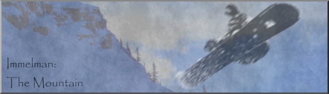
I agree with all the above and I have one thing to add myself: I'd choose a centred allignment for the text to put it in the focal point of the pic. Just my two cents... the whole idea is nice and very original.  :)
User avatar
Sytse
Major
Major
 
Posts: 3397
Joined: Fri Jun 24, 2005 5:26 am
Location: The Netherlands

Re: 1 Tail shot!

Postby Immelman » Fri Dec 22, 2006 6:20 pm

I assume you used photoshop for this edit, i dont know how it could be done any other way.
User avatar
Immelman
1st Lieutenant
1st Lieutenant
 
Posts: 409
Joined: Sat Jun 03, 2006 7:37 pm


Return to Edited Screenshots

Who is online

Users browsing this forum: No registered users and 684 guests