Page 1 of 1

my first 'proper' edit

PostPosted: Thu Oct 19, 2006 12:41 pm
by VVM
and by proper i mean more than just chaning contrast/colour etc.

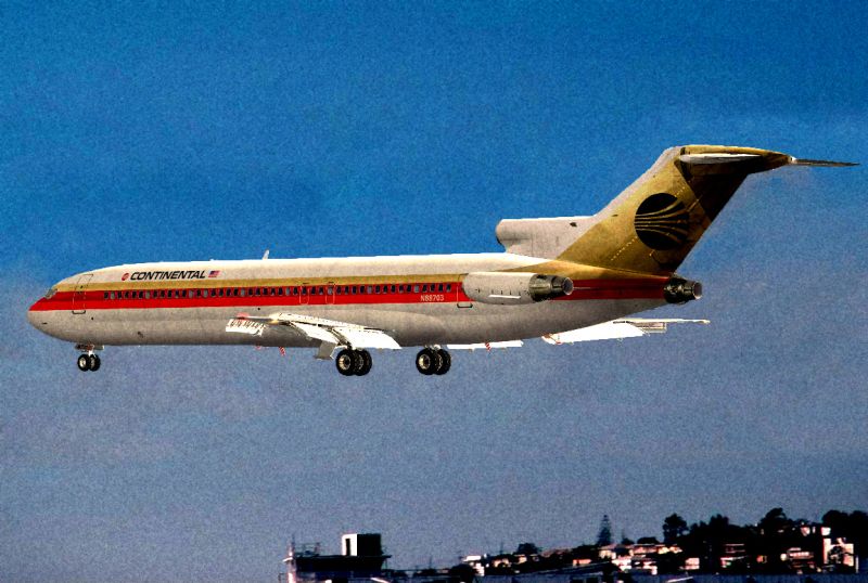
im really looking for advice on how too improve.  im not overly happy with the way this turned out.  the flaps look out of place,  and the top of the fuselage looks jaged.  appart from that, what do yous think?

Image

cheers   8)

Re: my first 'proper' edit

PostPosted: Thu Oct 19, 2006 5:24 pm
by Alonso
That's great morphediting!! why not send it into the Studio V contest?

Re: my first 'proper' edit

PostPosted: Fri Oct 20, 2006 2:12 am
by cspyro21
It's a good job indeed Vavavoom, but I think the reason that some parts on the aircraft look out of place is thanks to the lighting on the aircraft in relation to that of the background.
I hear you ask, "What's the remedy for this problem?"

...I have no idea. ;D

As for the jaggy aircraft (which isn't terribly jaggy as it is), perhaps you could use a soft, weak blur tool (assuming you're using Photoshop, Paint Shop Pro or anything with a blur tool) and perhaps blur the edges slightly....??? (Just I guess, I've no idea if this works :D)

Other than those two problems you raised, for a first edit you've done a proper job vavavoom! 8) 8) :)

Re: my first 'proper' edit

PostPosted: Fri Oct 20, 2006 8:42 am
by Sytse
You asked for advice, so here goes...

Not bad, Vavoom, but I think your picture is lacking an important aspect of a good pic: balance.

The plane is right in the centre of the pic, wich isn't too bad, but you can get a more interesting pic to look at if you place the main subject just a little off centre. (Don't let it touch the edges though!)

Second, the dark scenery in the background is confusing and puts the pic out of balance. What I mean is this: When I look at the pic my eye first focusses on the plane. I look at the red line on the fuselage, the flaps, the cockpit the tail section... But then my eye gets drawn to the scenery, beacause of it's great contrast to the sky. My eye has difficulty finding it's way back to the main subject (jet) because there is no path for it to follow. It somewhat jumps back an forth from the plane to the scenery, which is very uncomfortable.

To give your pic more balance you should give the eye some paths to travel along, so it can easily view the whole picture. You could add some cloud layers or vapor trails in the background for example.

The rest in the pic is actually very well done. The jaggies aren't that bad and the flaps don't look out of place to me. I like the time effect you created here.

I hope this helps you improve the pic. Keep it up!  ;)

Re: my first 'proper' edit

PostPosted: Fri Oct 20, 2006 8:59 am
by VVM
cheers for that all.  the reason the a/c is in the centre is that its a copy of a picture i found http://www.jetphotos.net/viewphoto.php?id=5810994 and the a/c is in the centre there.  i did use a bluring tool to soften the edges of the a/c but i didnt think that was the correct way too do it.

Re: my first 'proper' edit

PostPosted: Fri Oct 20, 2006 11:54 am
by Sytse
Ah, I see... Well... It's a bad photograph then, with the eye on composition. The colours, contrast and sharpness are good though...