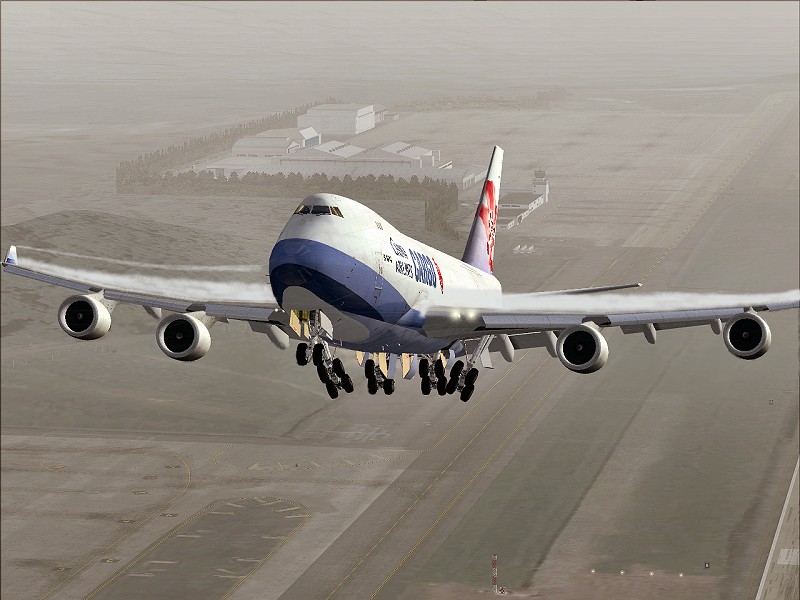
Page 1 of 1

Two edits...

PostPosted: Sat Oct 07, 2006 9:51 am
by Iwannabeapilot
All I did was change the colour balance, contrast etc...
Image

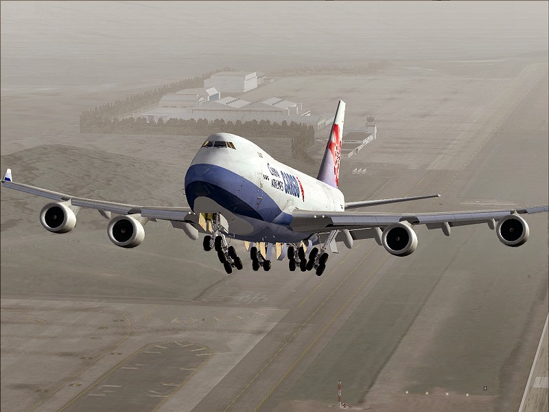
I've tried to create wing vortexes in this one, anyone have any tips to improve it?
Image

Thanks for looking, please feel free to give your thoughts  :)

Re: Two edits...

PostPosted: Sat Oct 07, 2006 11:47 am
by Dr._Who
Thats really good! ;D

Re: Two edits...

PostPosted: Sat Oct 07, 2006 12:27 pm
by Cobra
Really cool angle, and would look amazing, as you pointed out...with a bit more work on the wing condessation.

1stly it helps to use a picture for reference, so you know what your drawing...

Then i would say try and use a variety of shades of white, as yours is slightly monotonal. Also try to smoothen out your 'painting', because you can see the little circles from the brush tool.

If I was gonna do this though, i would just select the area for the condenstation, and fill it white with a slight gradient, then but a gaussian blur on it. Then simply just erase the messy bits so it fits.

LOL sorry just to chuck all this at you, i know its kinda jumbled. Hope it helps though :)

Re: Two edits...

PostPosted: Sat Oct 07, 2006 1:44 pm
by Iwannabeapilot
Thanks for the advice  8)

Re: Two edits...

PostPosted: Mon Oct 09, 2006 9:29 pm
by ctjoyce
for tha love of god, would people learn to use [url][/url] ?

BTW nice edits.

Cheers
Cameron

Re: Two edits...

PostPosted: Tue Oct 10, 2006 11:00 am
by wji
Cool . . . looks just like the real thing

Re: Two edits...

PostPosted: Tue Oct 10, 2006 3:17 pm
by born_2_fly
MY GOD THIS THREAD IS HUGE!

Cam is right though text links would have helped! ::)

Quite like it though...... LOL Just keeps on going, this is crazy...........................

Re: Two edits...

PostPosted: Tue Oct 10, 2006 3:28 pm
by Cobra
haha sorry guys, my bad. Didnt really looks just C&P'd the link  :-*