Thinkin of a better sig
So as the title says, I like the background of my current one, and I like the A320, But the outline is horrible. I took a photo from airliners.net (with permission) and made this:
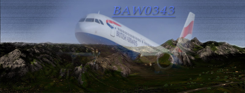
The plane is the way it is beacuse its wings were clipped in the photo and I couldnt size it right. So i think it look better now with some new effects, some better blending, and overall effect. which do you guys like better?
The background is actualy 2 screenshots blended togeather (nicely I think ;D )
