Simviation Forums
Flight Simulator and other chat
Flight Simulator and other chat
![]() by fighter25 » Sun May 20, 2007 7:22 pm
by fighter25 » Sun May 20, 2007 7:22 pm

![]() by bok269 » Sun May 20, 2007 7:23 pm
by bok269 » Sun May 20, 2007 7:23 pm

![]() by Kleen Harry » Sun May 20, 2007 7:37 pm
by Kleen Harry » Sun May 20, 2007 7:37 pm


![]() by Double_Farvel » Sun May 20, 2007 8:37 pm
by Double_Farvel » Sun May 20, 2007 8:37 pm

![]() by Kleen Harry » Sun May 20, 2007 11:26 pm
by Kleen Harry » Sun May 20, 2007 11:26 pm
![]() by krigl » Tue May 22, 2007 6:53 am
by krigl » Tue May 22, 2007 6:53 am
![]() by Kleen Harry » Tue May 22, 2007 9:26 am
by Kleen Harry » Tue May 22, 2007 9:26 am
![]() by FSGT Gabe » Tue May 22, 2007 10:06 am
by FSGT Gabe » Tue May 22, 2007 10:06 am


![]() by Kleen Harry » Tue May 22, 2007 6:56 pm
by Kleen Harry » Tue May 22, 2007 6:56 pm
![]() by NDSP » Wed May 23, 2007 3:27 pm
by NDSP » Wed May 23, 2007 3:27 pm
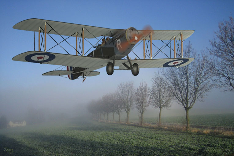
Oooops! Almost didn't notice the new comment!
Thanks a lot, Kevin! Much appreciated, M8! :)
Well, I kept messing with the opacity. It seemed to "blend" better with the background at a slightly lower opacity but then it blended too well and the subject seemed to get lost, hee, hee! I finally took into consideration that it was relatively close to the point of view and that it would therefor be ok for it to have a bit more punch than the background.
Saturation was an issue as well. The roundels are pretty strong in terms of color so I didn't want to blast them too much. However, considering that the green ground cover is pretty saturated I thought that I could get away with this level of saturation, especially since the roundel in the shadow is much more subdued.
Well, at some point we have to cut it loose and say, "good enough". I find that if I stay with an image too long that I lose "intuitive" sensitivity to it and lose my way more and more as intellect takes over. You know, don't over cook the eggs, hee, hee! ;)

![]() by Kleen Harry » Wed May 23, 2007 7:10 pm
by Kleen Harry » Wed May 23, 2007 7:10 pm
![]() by Immelman » Wed May 23, 2007 7:14 pm
by Immelman » Wed May 23, 2007 7:14 pm

Users browsing this forum: No registered users and 582 guests