enjoy
eno
Flight Simulator and other chat
![]() by eno » Wed Mar 25, 2009 1:11 pm
by eno » Wed Mar 25, 2009 1:11 pm
![]() by Anxyous » Wed Mar 25, 2009 1:23 pm
by Anxyous » Wed Mar 25, 2009 1:23 pm


![]() by C » Wed Mar 25, 2009 2:33 pm
by C » Wed Mar 25, 2009 2:33 pm
An hour well spent
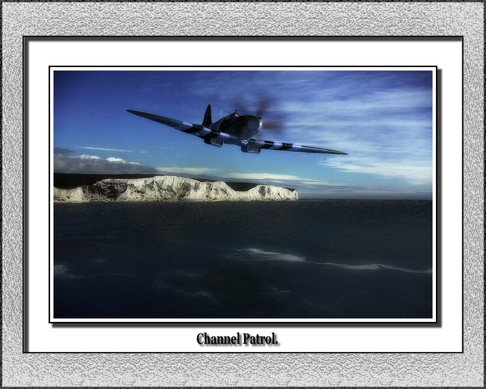
Though 2-3 borders are too many IMO... I'd at least drop the outermost one
![]() by patchz » Thu Mar 26, 2009 6:32 am
by patchz » Thu Mar 26, 2009 6:32 am


![]() by -Crossfire- » Fri Mar 27, 2009 9:05 pm
by -Crossfire- » Fri Mar 27, 2009 9:05 pm


Users browsing this forum: No registered users and 394 guests