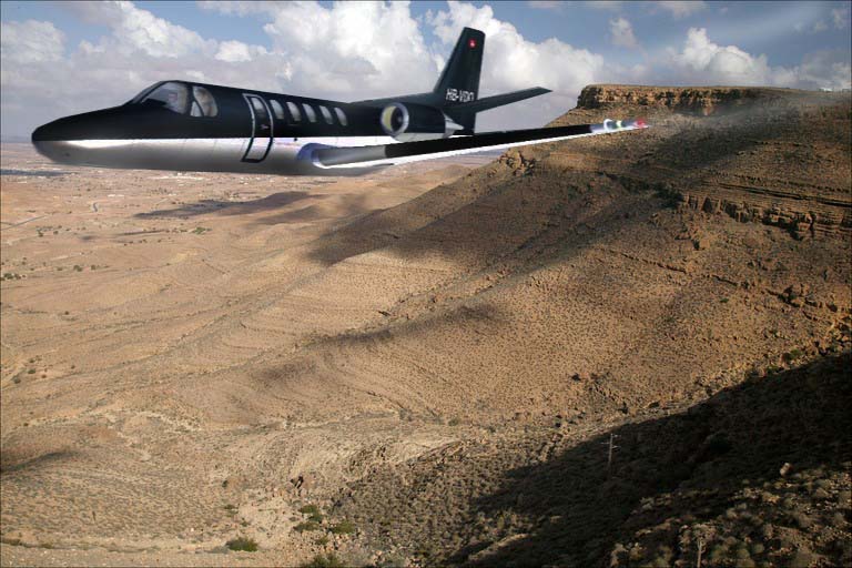
This is my first composite. Not the greatest but tell me what to do 
Flight Simulator and other chat
![]() by cloud9 » Sun Mar 04, 2007 7:03 pm
by cloud9 » Sun Mar 04, 2007 7:03 pm

![]() by ThatOnePerson » Sun Mar 04, 2007 7:06 pm
by ThatOnePerson » Sun Mar 04, 2007 7:06 pm
 Other than that, I like it
![]() by cloud9 » Sun Mar 04, 2007 7:12 pm
by cloud9 » Sun Mar 04, 2007 7:12 pm
![]() by FSGT Gabe » Sun Mar 04, 2007 9:24 pm
by FSGT Gabe » Sun Mar 04, 2007 9:24 pm


![]() by krigl » Mon Mar 05, 2007 4:23 am
by krigl » Mon Mar 05, 2007 4:23 am
![]() by Sytse » Mon Mar 05, 2007 6:33 am
by Sytse » Mon Mar 05, 2007 6:33 am

Users browsing this forum: No registered users and 591 guests